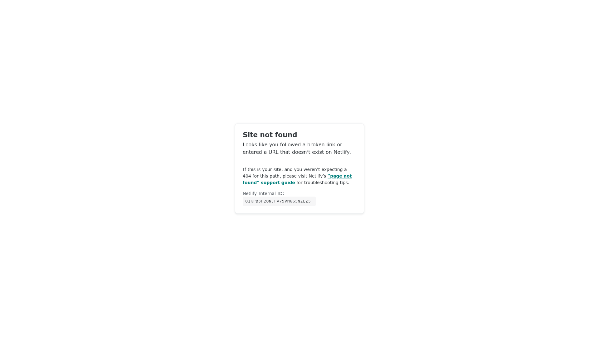
Netlify Default 404 Error Page
A minimal, centered error card layout featuring a clean white container, bold typography, and a distinct internal ID display for troubleshooting.
Overview
This is the default Netlify 404 error page, featuring a minimal, card-centered layout. It is an excellent reference for builders who need a clean, functional "not found" state that provides immediate context and troubleshooting data while maintaining a neutral professional aesthetic.
Design System
- Color Palette & Visual Hierarchy: The design uses a high-contrast monochromatic base with a primary accent color. It features a bright white card (background-color: white) set against a very light gray background (#f9f9fb). Text is dark gray/charcoal for readability, while links utilize a distinctive teal/cyan accent color to draw attention to support resources.
- Typography System: The system relies on clean, sans-serif typography. The header ("Site not found") uses a bold weight with high prominence. Secondary text is smaller with standard line-heights, and technical data (Internal ID) is presented in a monospace font to distinguish machine-readable data from human-readable copy.
- Page Structure: The layout follows a simple centered flexbox or grid pattern. The content is contained within a single
carddiv containing a heading, descriptive paragraph, a horizontal rule (<hr>) for visual separation, and a footer section for technical support information. - Reusable Components: The central
.cardis the primary reusable asset, featuring subtle rounding and a light border-radius. The.inline-codespan is also highly reusable for displaying technical identifiers or code snippets within a UI. - Implementation Clues: The HTML structure is semantically lean, using a
.mainwrapper and a.cardcontainer. The use of a simple<code>tag within a custom span suggests a focus on accessibility and standard-compliant markup for technical errors.
Use Cases
- Who should clone this pattern: Developers building SaaS platforms, hosting services, or technical dashboards who need a standardized error handling state.
- What products can remix it effectively: Documentation sites, developer tools, or any platform where providing a unique "Request ID" or "Correlation ID" is critical for customer support workflows.
- Practical remix directions: Replace the basic
<hr>with internal brand iconography, swap the teal link color for brand-specific primary buttons, or add a "Back to Home" CTA button below the technical ID. - Suggested clone scope: This is best as a quick full-page clone for an error route, as it is self-contained and requires minimal modification to be functional in a production environment.
Related Inspirations

Isla Beauty Skincare E-commerce Store
A clean Shopify-based storefront featuring a split-hero landing page, a step-by-step product system carousel, and a split-screen testimonial section with localized product image sidebars.
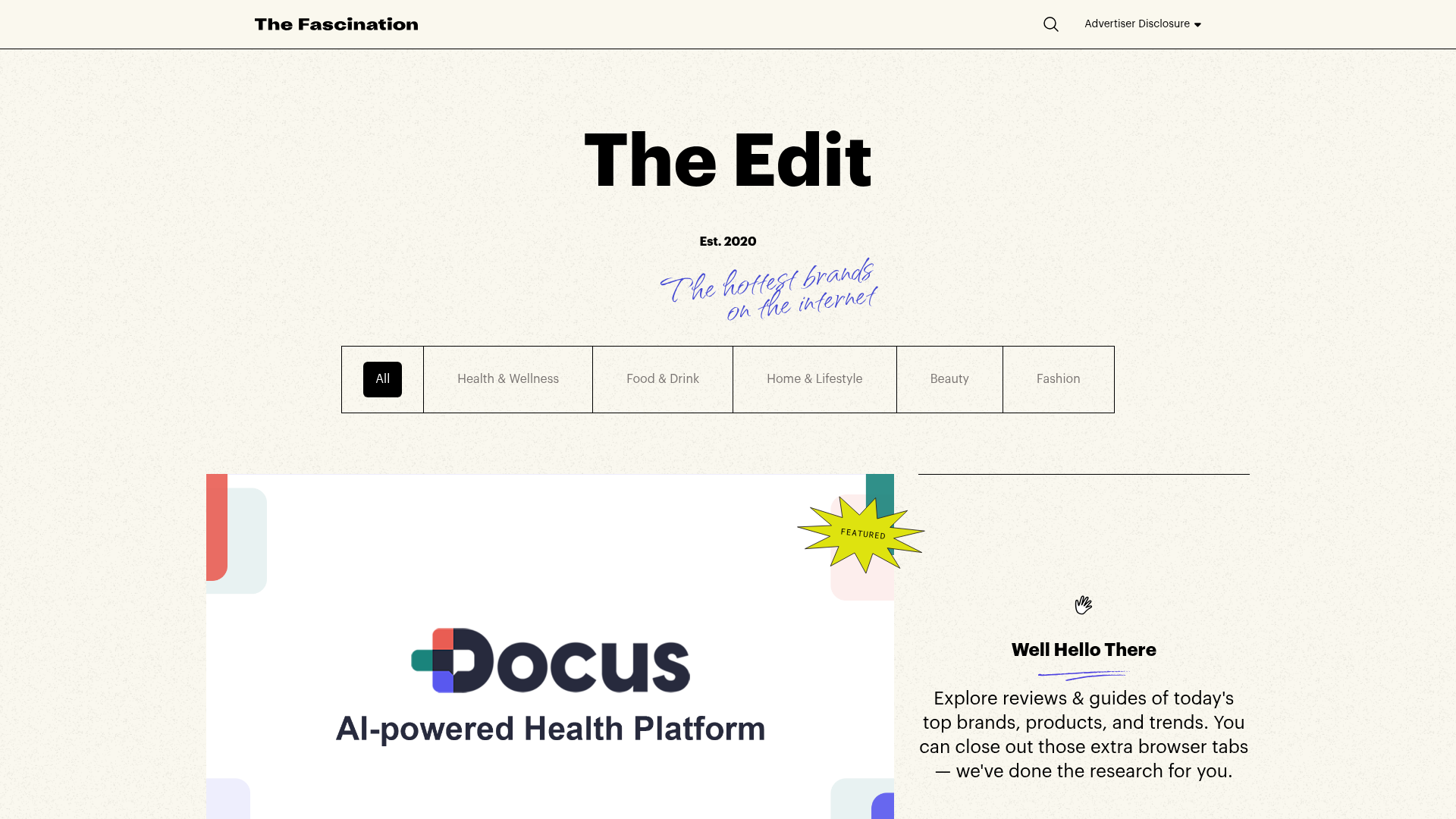
The Fascination Editorial Product Hub
A refined content marketplace layout featuring a minimalist bento-style grid, custom category filters, and modern hovering card interactions for brand reviews.

Baubauwerk Minimal Agency Portfolio Homepage
A clean studio site featuring a centered text hero, scatter-plot filterable project gallery, and full-bleed image sections for case studies.
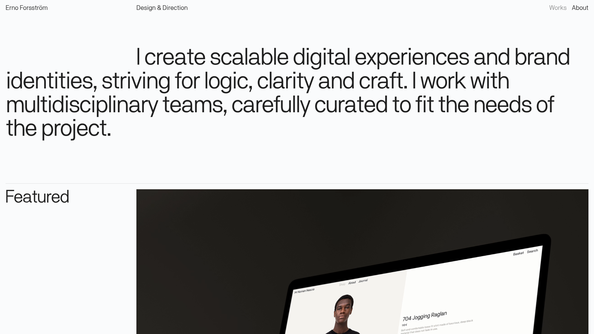
Erno Works Minimalist Design Portfolio
A clean, typography-focused portfolio featuring a sticky grid layout, large editorial headers, and integrated video project thumbnails for dynamic case study previews.
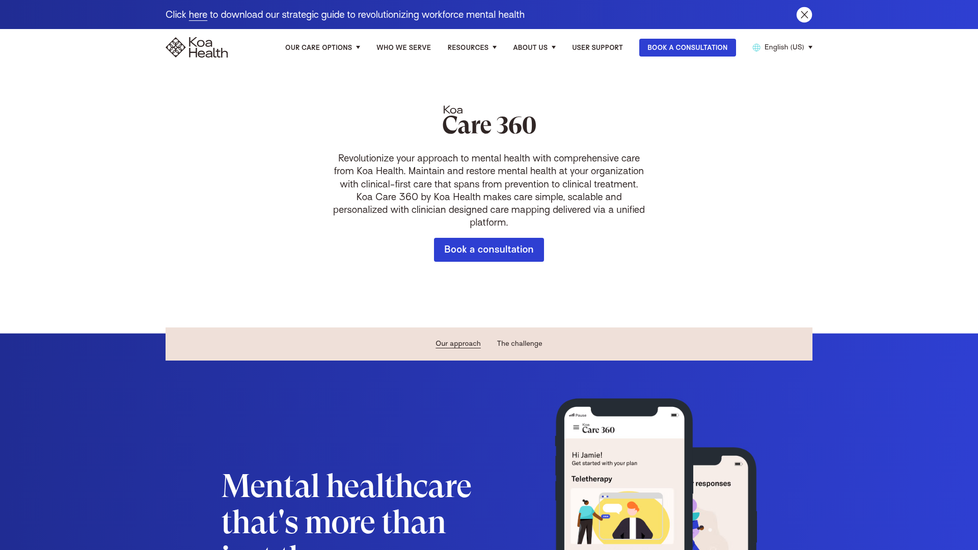
Koa Health Mental Care Landing Page
A clean healthcare landing page featuring a centered hero section, scroll-based fade-in animations, overlapping mobile mockups, and a multi-column feature grid with accent borders.
Joshua Kaplan Portfolio Index
A minimalist, text-only portfolio layout featuring an expansive tabular list of projects with horizontal rule separators and clean typography.
