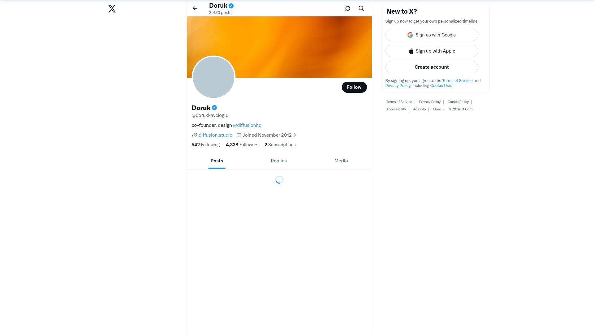
X Profile Page Interface
A comprehensive social media profile layout featuring a responsive header image, circular avatar integration, sidebar authentication widgets, and a tabbed content navigation system.
Overview
This interface is a high-fidelity clone of the X (formerly Twitter) profile page, representing a classic social media architecture. It effectively balances personal branding, user metadata, and conversion-focused sidebar widgets, making it a gold standard for account-centric platforms. Builders should reference this for its sophisticated handling of overlapping elements and standardized information hierarchy.
Design System
- Color Palette & Visual Hierarchy: The design utilizes a high-contrast monochromatic base (White
#FFFFFF, Dark Grey#0F1419, and Secondary Grey#536471) with a vibrant primary action color (Sky Blue#1D9BF0). Visual hierarchy is established through font weight and color; primary bio info is black, while secondary metadata like join date and handle use a muted grey. - Typography: A clean, sans-serif system (likely Helvetica Neue or a system native stack) optimized for readability. It uses a tiered scale: bold headers for the name (
h2), medium weights for numbers (follower counts), and regular weights for body copy and handles. - Page Structure: The layout follows a classic three-column pattern: a narrow left sidebar for brand/navigation, a wide central feed, and a right-side conversion/discovery column. The central column features a 3:1 aspect ratio header image with a circular avatar that overlaps the boundary.
- Reusable Components:
- The Profile Header: A complex layered component featuring a background image, a bordered circular avatar, and a primary "Follow" button.
- Authentication Widget: A dedicated sidebar card containing branded social login buttons (Google, Apple) and a primary "Create account" call-to-action.
- Tabbed Navigation: Simple, underlined text tabs (Posts, Replies, Media) for content filtering.
- Interaction & Motion: The HTML indicates the use of
transition: transform 200ms ease-outfor the bottom sticky signup bar. Buttons feature hover states that slightly dim or brighten colors (r-o7ynqc). - Implementation Clues: The DOM structure reveals a heavy reliance on React Native Web (indicated by the
css-175oi2rclasses) and a flexible box model (display: flex) to manage complex alignment like the overlapping avatar position (r-1v2oles).
Use Cases
- Who should clone this: Developers building social networks, creator economy platforms, or internal company directories where personal identity and activity feeds are central.
- Effective Remixes: This pattern is perfect for portfolios (replacing "Posts" with "Projects") or community forums. The sidebar authentication widget can be remixed into a "Subscribe" or "Support" CTA for SaaS products.
- Practical Directions: Swap the rigid monochrome for a more playful brand palette while keeping the information architecture. Reuse the "Header + Overlapping Avatar" section to immediately establish a high-end social feel in any app.
- Clone Scope: A full-page clone is ideal for social-first apps, while specific components—like the authentication card or the metadata row—are excellent for quick, modular reuse in larger dashboards.
Related Inspirations
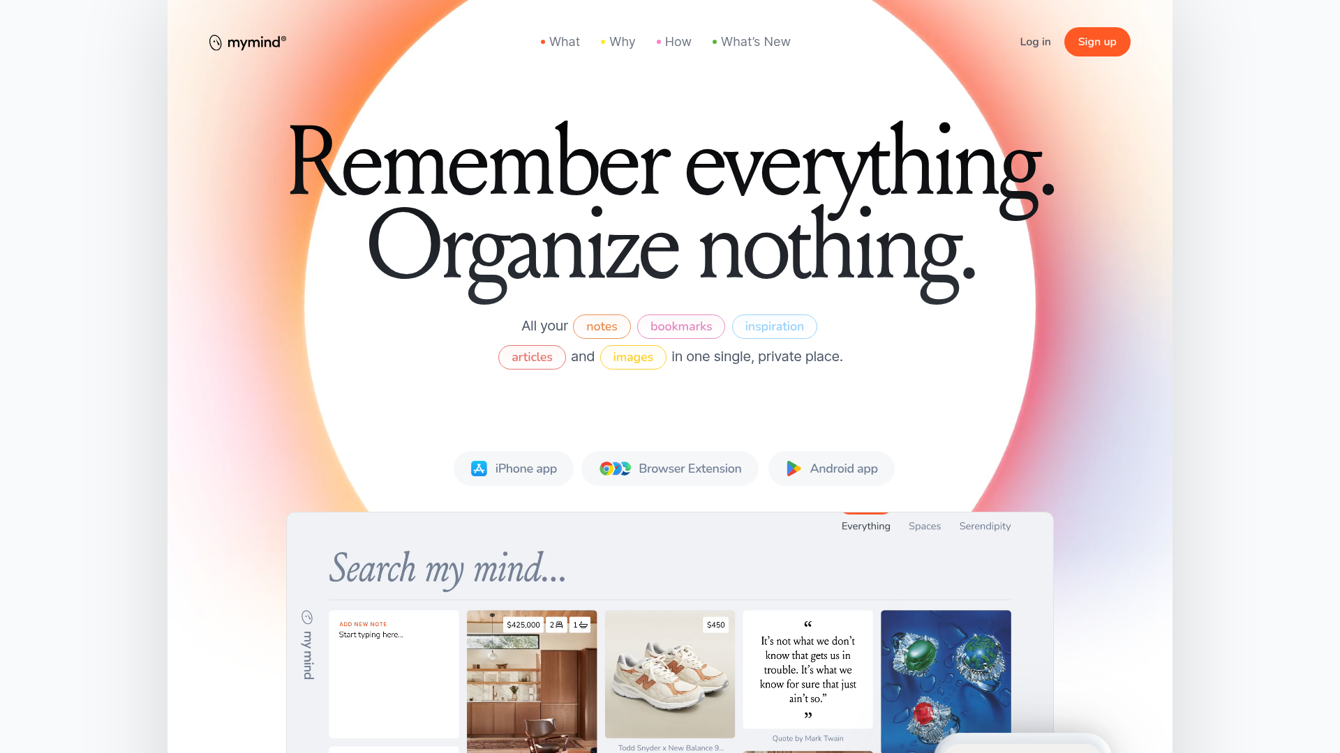
Mymind AI Tool Landing Page
A minimalist SaaS landing page featuring a soft-gradient hero section, custom pill-shaped text badges, and a dynamic bento-style search result preview grid.
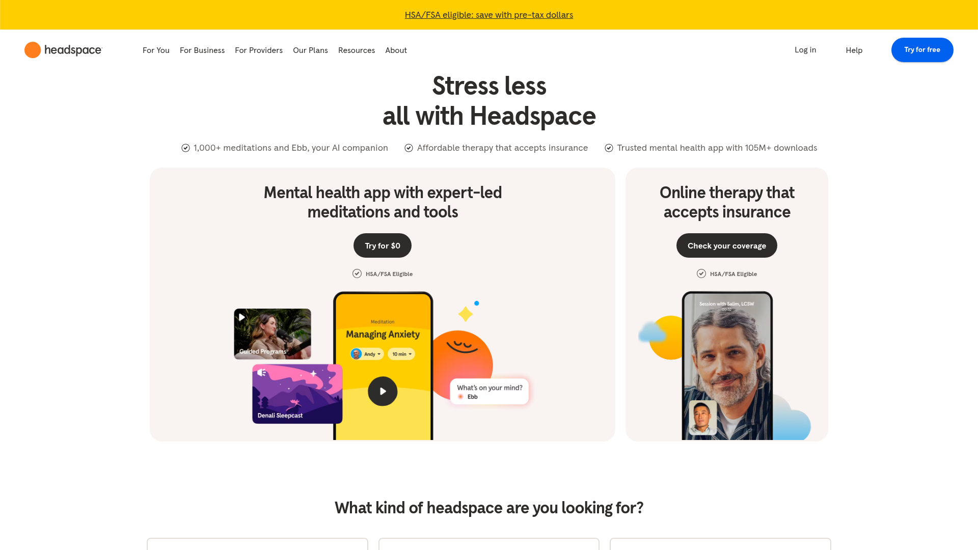
Headspace Mental Health Landing Page
A clean health-tech landing page featuring split hero cards, a tabbed service switcher with built-in audio players, and an auto-scrolling brand logo carousel.
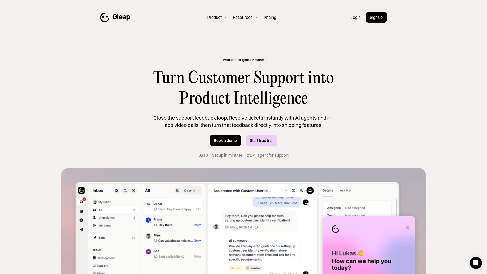
Gleap Product Intelligence Platform Landing
A SaaS template featuring a central video hero, comparison pricing tables, tabbed feature navigation, and a testimonial grid with major brand logos.
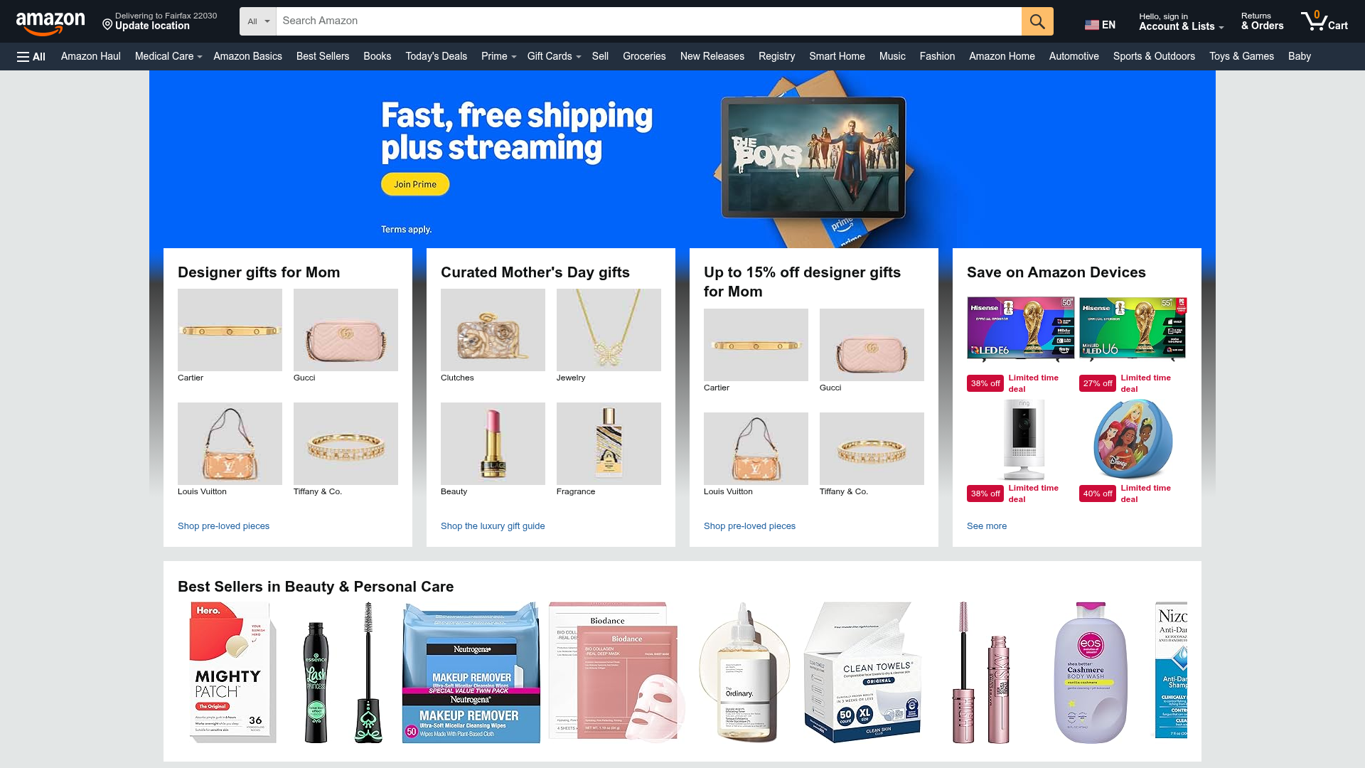
Amazon E-commerce Marketplace Dashboard
A dense retail landing page featuring a searchable navigation header, rotating hero carousel, and a structured bento-style grid of product category cards with quad-image layouts.
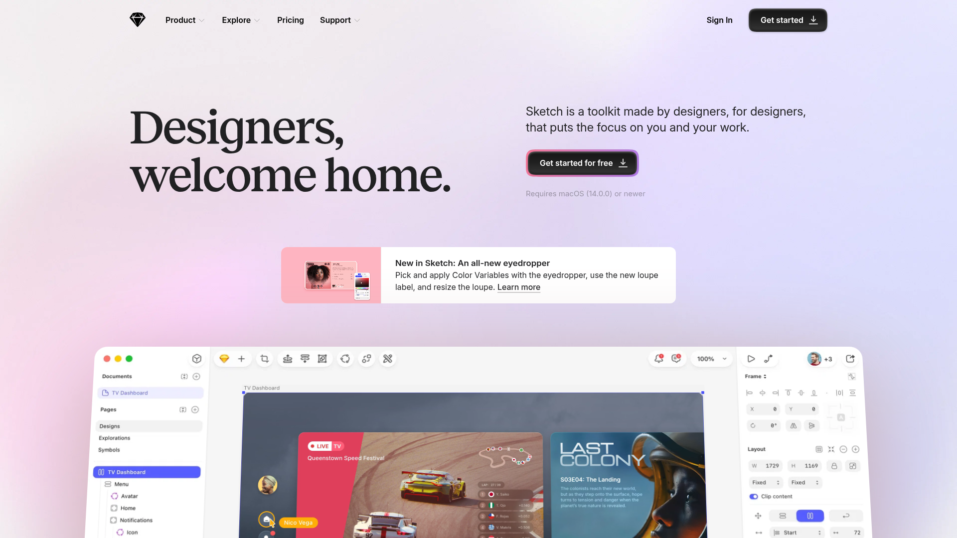
Sketch Design Tool Landing Page
A refined marketing layout featuring a soft gradient hero, modern bento grid sections with video embeds, a testimonial carousel, and an auto-scrolling customer logo marquee.
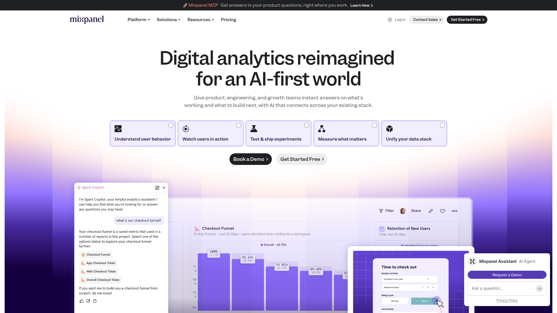
Mixpanel AI-First Product Landing Page
Features a modern gradient hero with a segmented feature selector, interactive dashboard previews, and integrated AI assistant chat UI components.
