Mixpanel AI-First Product Landing Page
Features a modern gradient hero with a segmented feature selector, interactive dashboard previews, and integrated AI assistant chat UI components.
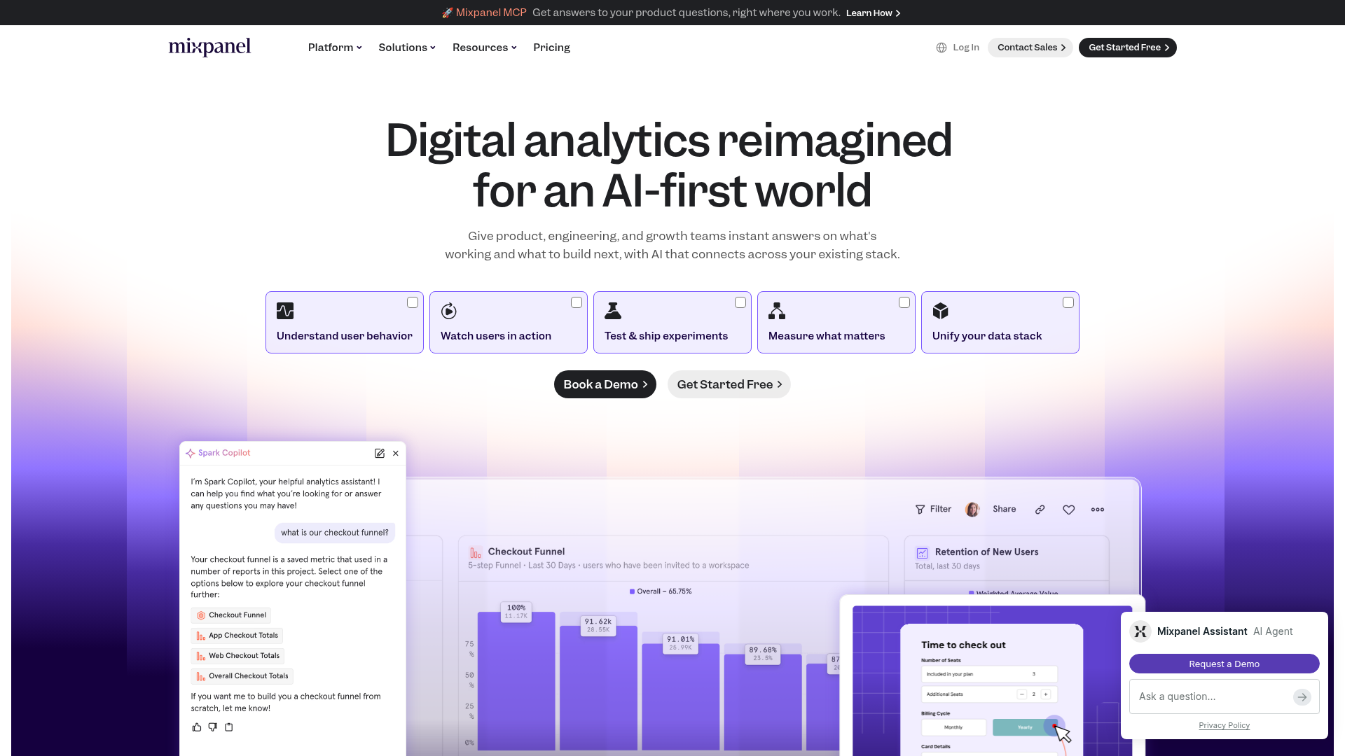
Overview
This landing page for Mixpanel showcases an AI-first design philosophy, utilizing a sophisticated deep purple gradient and a structured, modular layout to present complex data analytics. It serves as an excellent reference for SaaS companies looking to blend traditional dashboards with modern conversational AI interfaces and segmented navigation controls.
Design System
- Color Palette & Visual Hierarchy: The site uses a high-contrast dark-and-light theme. The primary accent is a rich indigo/purple (
#4F46E5style) used for gradients and primary buttons. Deep charcoal backgrounds (#1D1D1F) for the navbar and CTA buttons provide strong focal points against the soft lavender and white fields. - Typography System: San-serif fonts are used throughout with a clear hierarchy. The hero headline uses a semi-bold weight with tight letter spacing for impact, while subheaders and body text utilize generous line heights to maintain readability amid technical content.
- Page Structure: The layout follows a classic F-pattern: a thin global announcement banner, a clean persistent top nav, a centered hero with a large headline, a horizontal grid of five selectable "feature buckets," and a large interactive visual area showing synchronized UI previews.
- Reusable Components:
- Feature Selector Cards: Five distinct icon-led cards with checkbox indicators that likely toggle the secondary content.
- AI Chat Widget: A floating sidebar UI depicting a "Spark Copilot" interface with message bubbles and pill-style data targets.
- Pill Buttons: Rounded buttons with subtle hover states for "Book a Demo" and "Get Started Free."
- Interaction & Motion: The design implies a state-driven content area where clicking a top feature card swaps the dashboard preview below. The layout uses a vertical gradient background that guides the eye from the headline down into the product visuals.
- Implementation Clues: The HTML structure suggests a modern framework setup with localized containers. The use of clear class names like
nav_logoandheader_btnindicates a modular CSS or utility-based styling approach.
Use Cases
- Who should clone this pattern: Developers building B2B SaaS platforms, enterprise data tools, or AI-integrated software that needs to explain complex workflows simply.
- Effective Remixes: This pattern works well for developer tools or fintech apps. The "feature selector" grid is particularly useful for products with 4-6 distinct core functions that all share a single dashboard view.
- Practical Remix Directions: Swap the purple gradient for a brand-specific secondary color; adapt the UI visual frames to show your own product screenshots; repurpose the AI chat sidebar as a persistent help center or onboarding guide.
- Suggested Clone Scope: For a quick win, clone the hero section across the top feature cards. To build a full marketing page, focus on the synchronization between the cards and the central dashboard visualization below.
Related Inspirations
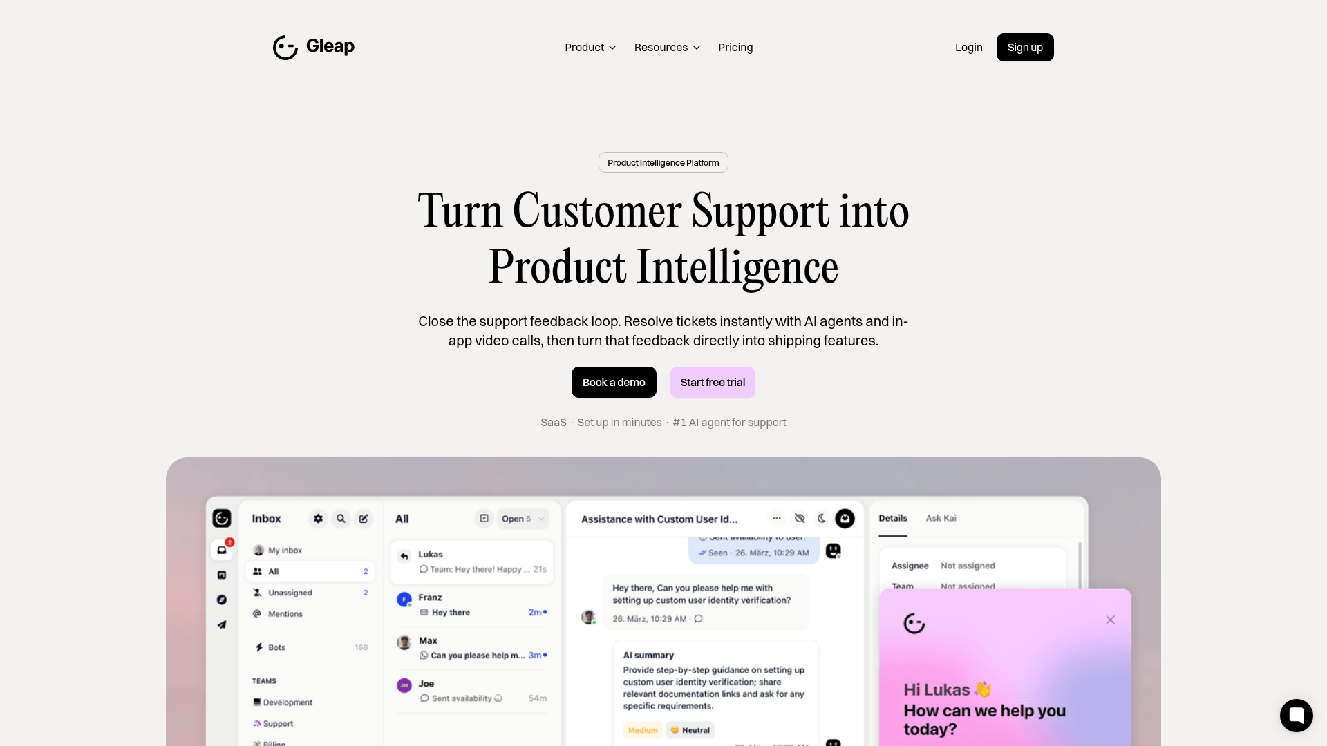
Gleap Product Intelligence Platform Landing
A SaaS template featuring a central video hero, comparison pricing tables, tabbed feature navigation, and a testimonial grid with major brand logos.
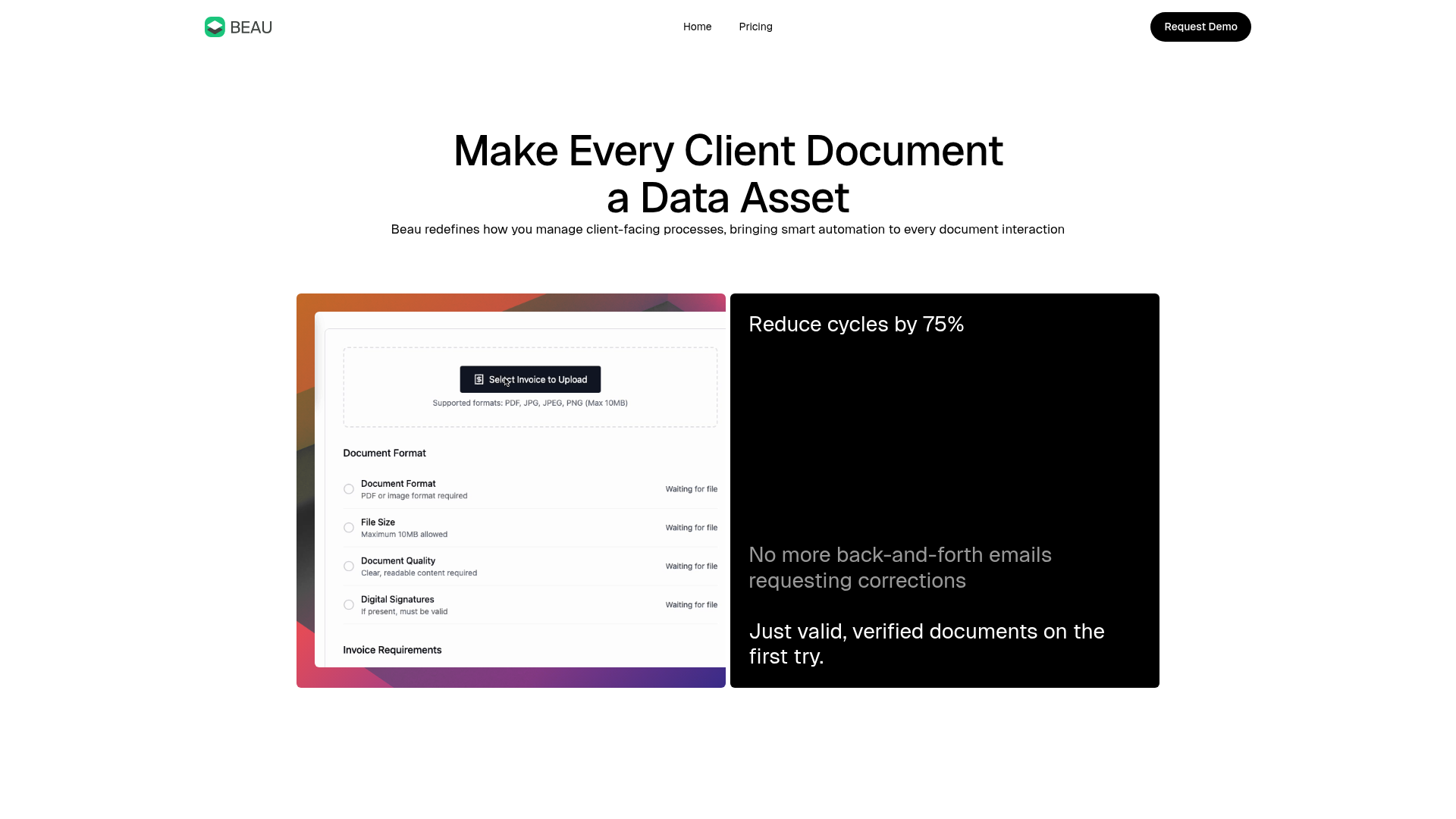
Beau Document Automation Landing Page
A modern software landing page featuring a bento-grid layout, split-screen hero assets with animated checkmarks, a step-by-step process guide, and a clean two-tier pricing table.
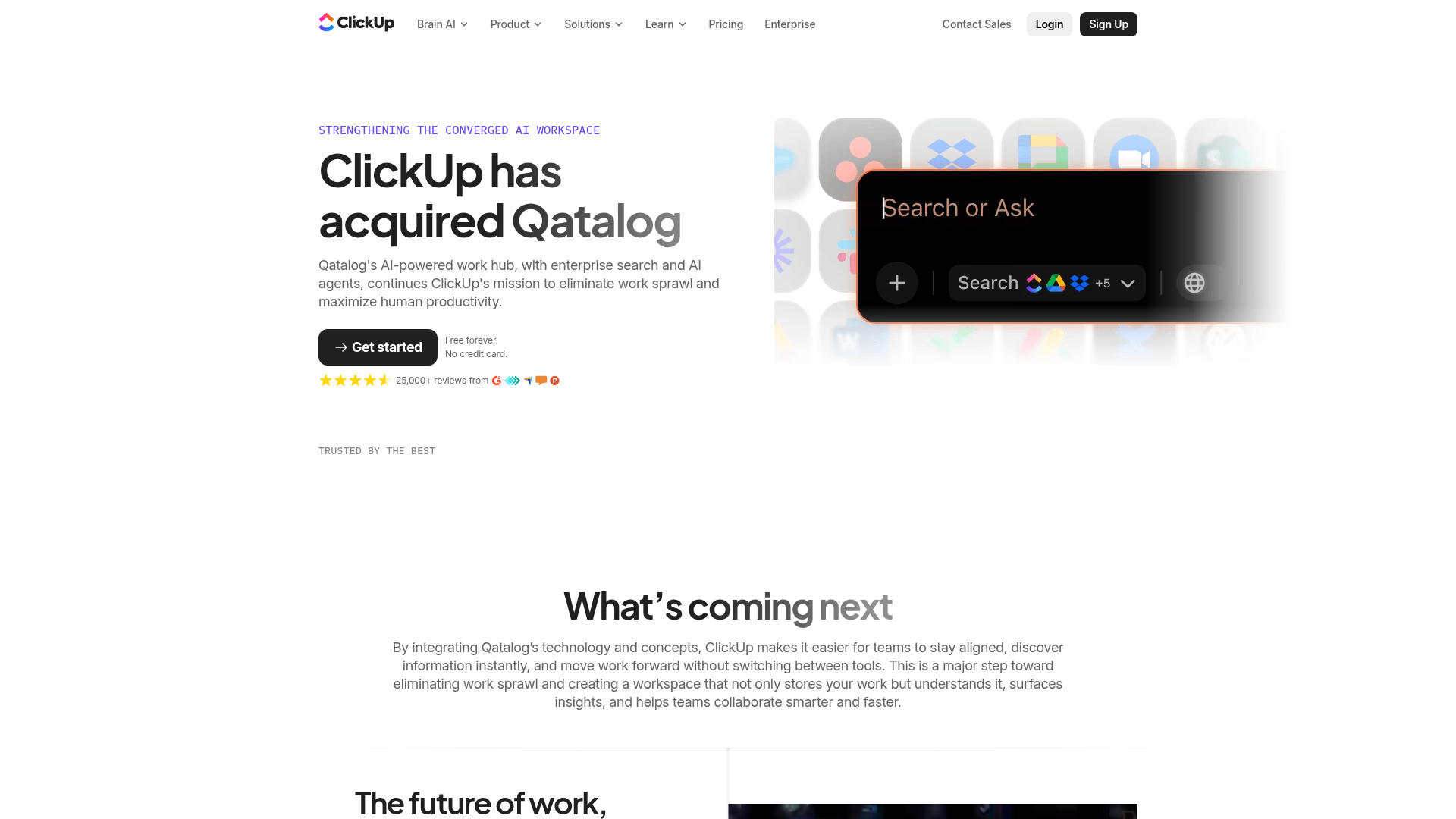
ClickUp Acquisition Hero Landing Page
Features a modern dark-themed hero section with a search UI graphic, bento-style feature grid, and a high-contrast CTA section with decorative gradients.
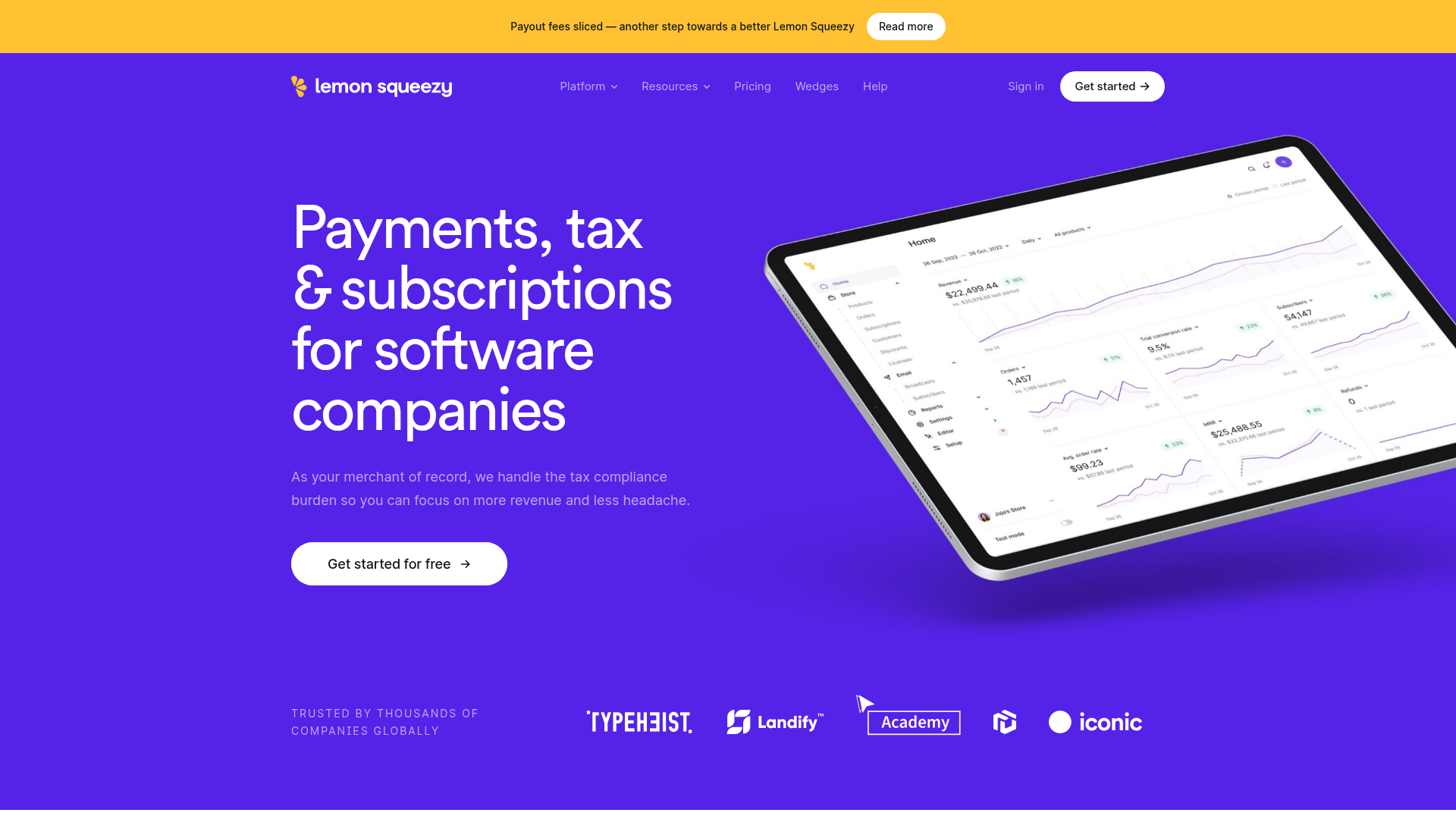
Lemon Squeezy SaaS Platform Landing Page
A high-conversion SaaS layout featuring a vibrant gradient hero, vertical tabbed feature sections, skewed device mockups, and a layered testimonial grid.
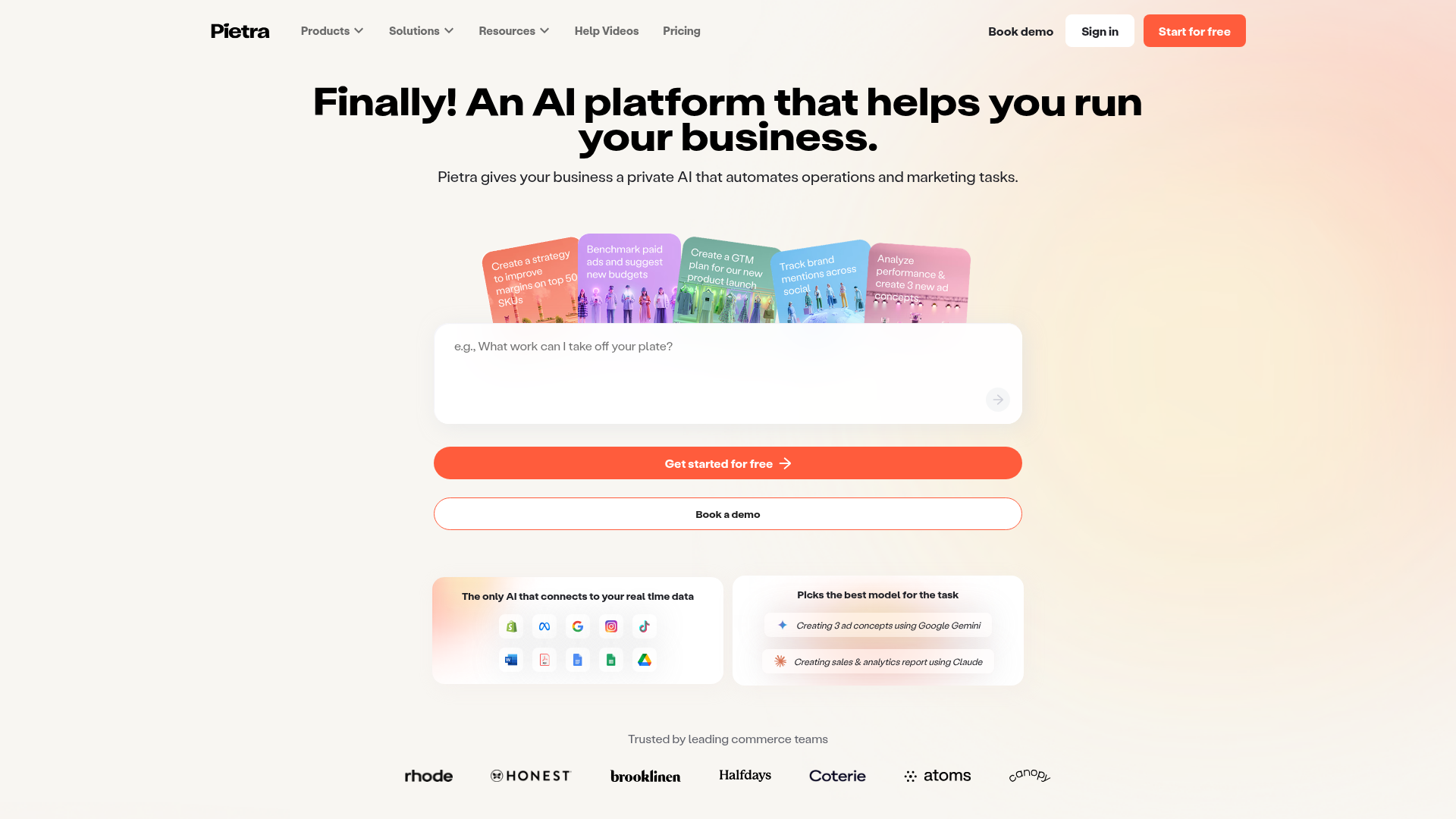
Pietra AI Platform Landing Page
A commerce-focused landing page featuring a centralized AI input hero, colorful floating value-prop cards, a bento-style integration showcase, and tabbed feature sections with side-by-side comparisons.
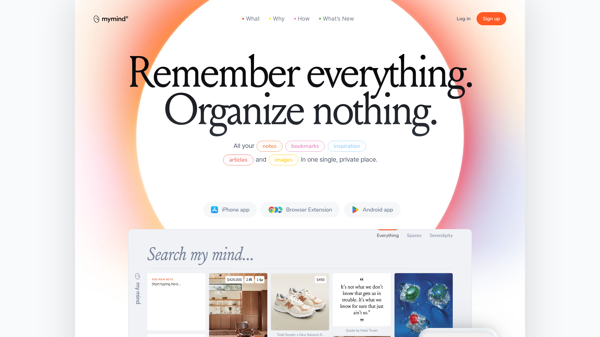
Mymind AI Tool Landing Page
A minimalist SaaS landing page featuring a soft-gradient hero section, custom pill-shaped text badges, and a dynamic bento-style search result preview grid.
