Posthuman Studio Portfolio Gallery
A creative portfolio featuring a freeform masonry gallery with staggered media layout, sticky logo navigation, and integrated video hover thumbnails.
Overview
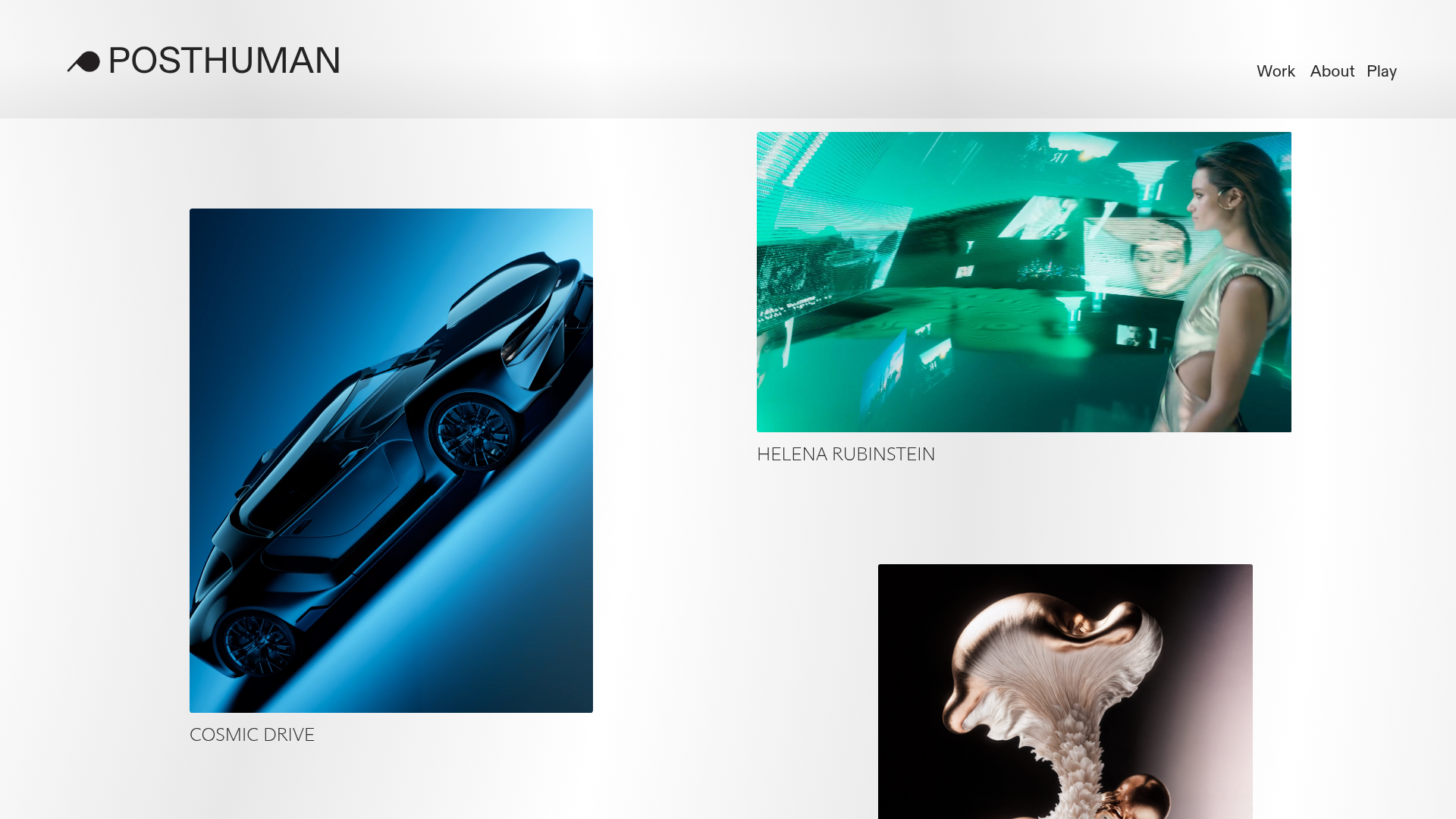
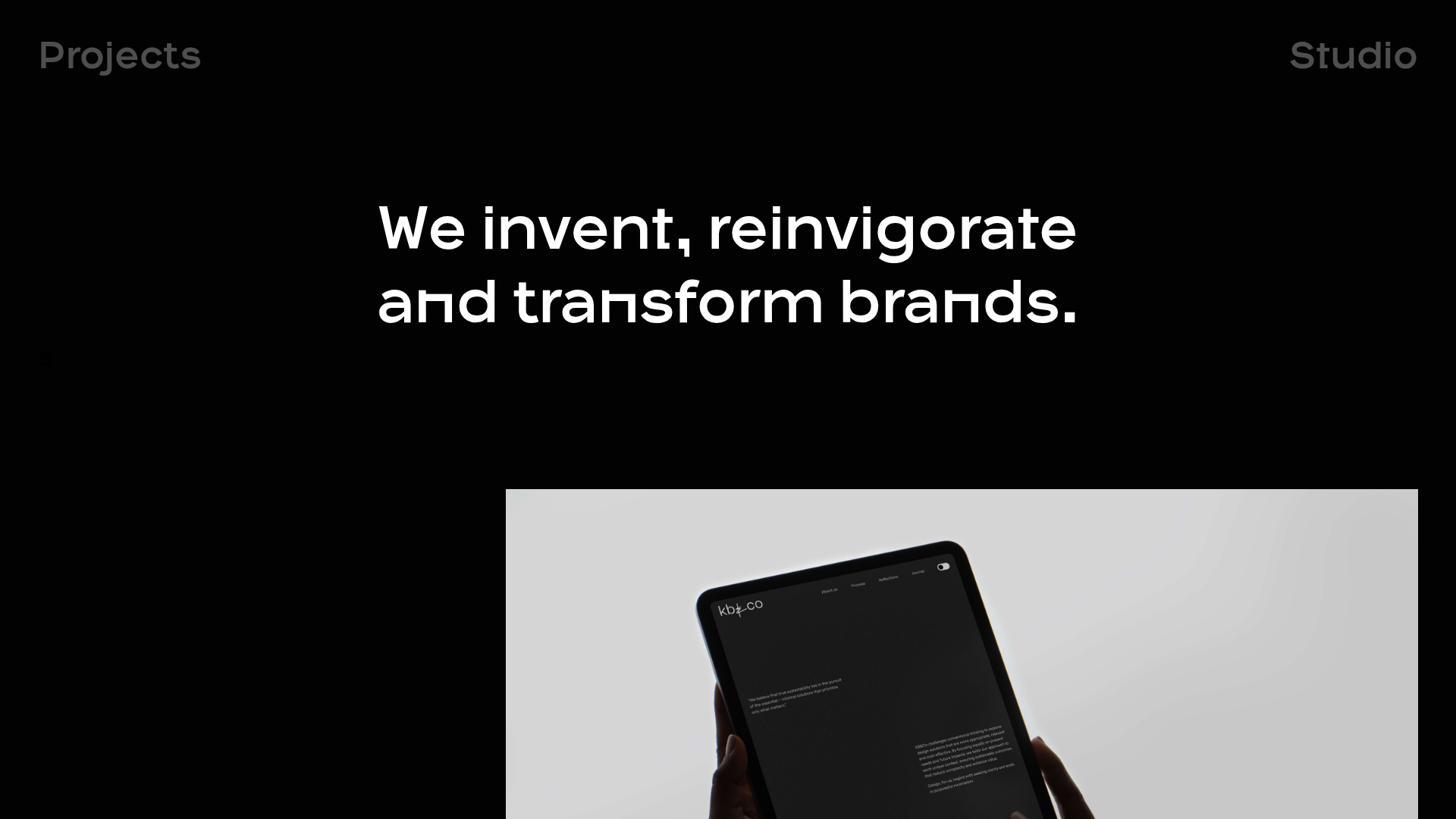
Posthuman Studio Portfolio is a high-end creative showcase featuring a sophisticated freeform masonry gallery that breaks the traditional grid. It serves as an excellent clone reference for its seamless integration of auto-playing video thumbnails and a minimal, sticky navigation system that remains secondary to the visual content.
Design System
- Color Palette & Visual Hierarchy: A clean, high-contrast palette of white and black (#000000) creates a neutral backdrop for vibrant, multi-colored media. Visual hierarchy is established through image scale and staggered placement rather than text size.
- Typography: A minimalist sans-serif system using all-caps for project titles (e.g., "COSMIC DRIVE", "HELENA RUBINSTEIN"). Titles use a light font-weight and generous tracking, while the navigation uses a slightly bolder weight for the active brand mark.
- Page Structure: The site uses a two-tier structure: a fixed header containing the branding on the left and navigation links (Work, About, Play) on the right, followed by a
gallery-freeformcontainer that allows for asymmetrical image positioning. - Reusable Components:
- Sticky Header: A lightweight, pinned top navigation (
pinned-top fixed) that uses flexbox to justify content. - Media Cards: Custom
media-itemcomponents that wrap both static images and<video>tags withplaysinline,autoplay, andloopattributes. - Hover Captions: Captions are positioned directly below or overlapping media, maintaining a tight relationship between title and visual.
- Sticky Header: A lightweight, pinned top navigation (
- Interaction & Motion: The interface relies on automatic video playback within the gallery items to create a sense of life. The HTML evidence of
video-player-playingvsvideo-player-stoppedclasses suggests a state-based visibility toggle often triggered by viewport entry or hover. - Mobile Behavior: The
gallery-freeformcomponent includesmobile-gutter="2rem"andmobile-stack="true"attributes, indicating a transition from an asymmetrical spread to a simplified vertical stack on smaller screens.
Use Cases
- Who should clone this: Motion designers, 3D artists, and creative agencies looking to showcase a high volume of visual work without the clinical feel of a standard square grid.
- Effective Remixes: This layout is perfect for fashion lookbooks or architecture portfolios where the scale and orientation of each project image should vary to reflect the content.
- Remix Directions: Builders could swap the white background for a dark mode palette to emphasize cinematic lighting in their work, or replace the freeform layout with a rigid CSS Grid while keeping the video-on-hover logic.
- Suggested Clone Scope: Start by cloning the
gallery-freeformstructure to master the absolute positioning and z-indexing (freeform-z) of media items before implementing the full multi-page navigation.
Related Inspirations
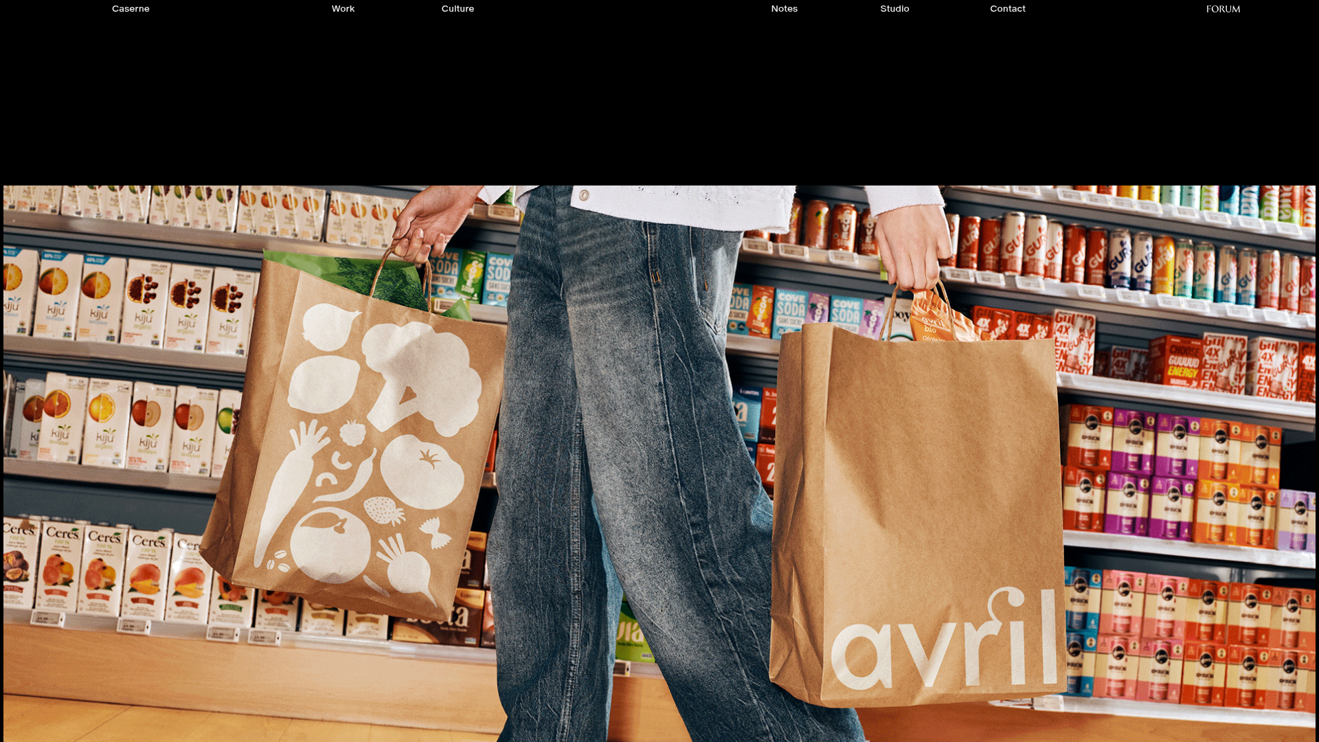
Caserne Design Studio Portfolio
A minimalist, high-impact portfolio featuring a dynamic masonry grid of project thumbnails with overlay text and a clean, oversized typography-driven footer.
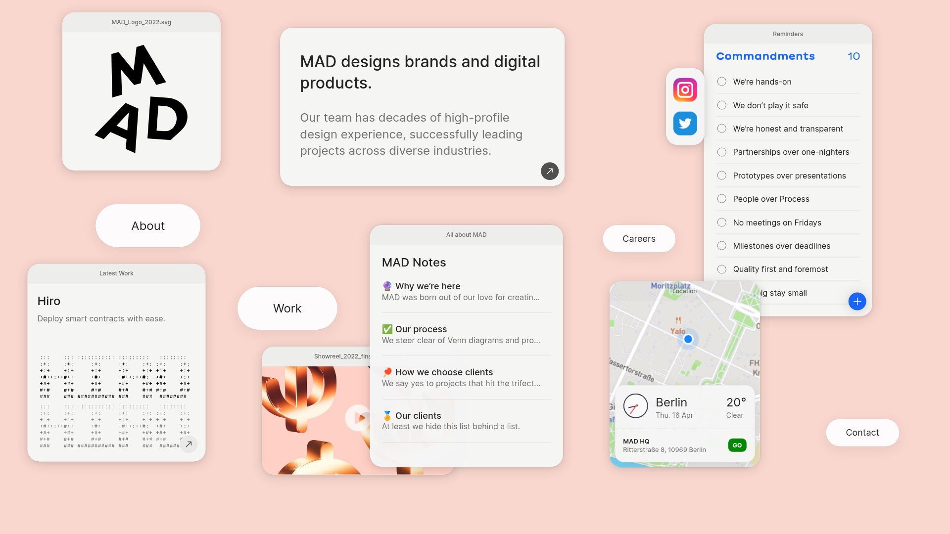
MAD Agency Interactive Dashboard Portfolio
A creative workspace-style layout featuring draggable OS-like applets, including interactive notes, a map widget with live weather, and a custom task checklist.
Catherine Peacock Designer Portfolio Home
A minimalist portfolio layout featuring a vertically stacked masonry project grid, sticky navigation with animated icons, and offset typography.
OPX Studio Agency Portfolio
A minimalist dark-themed portfolio featuring a staggered masonry project grid, cinematic video embeds, and a responsive oversized typography hero section.
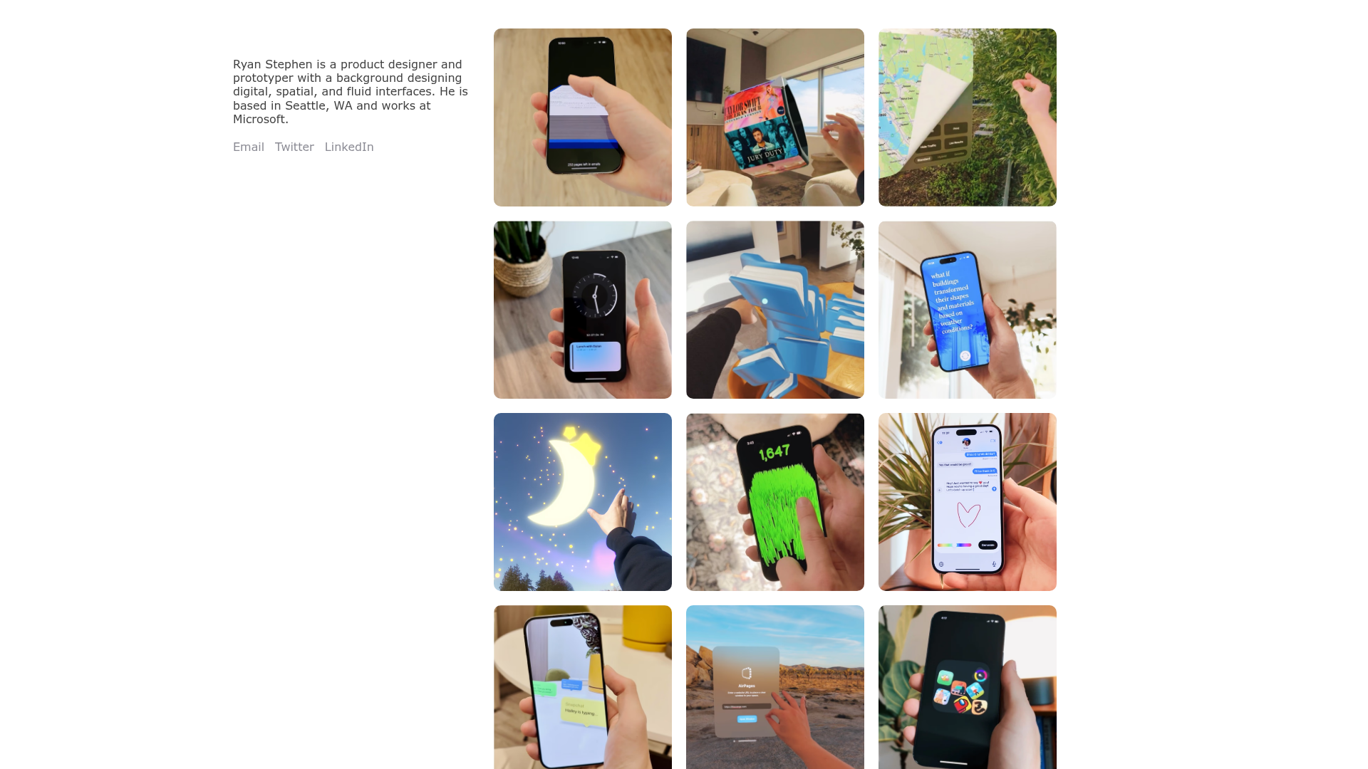
Ryan Stephen Portfolio Grid Layout
A clean, responsive portfolio featuring a sticky bio sidebar and a minimalist 3-column media grid with hover-ready image cards for showcasing spatial and UI design projects.
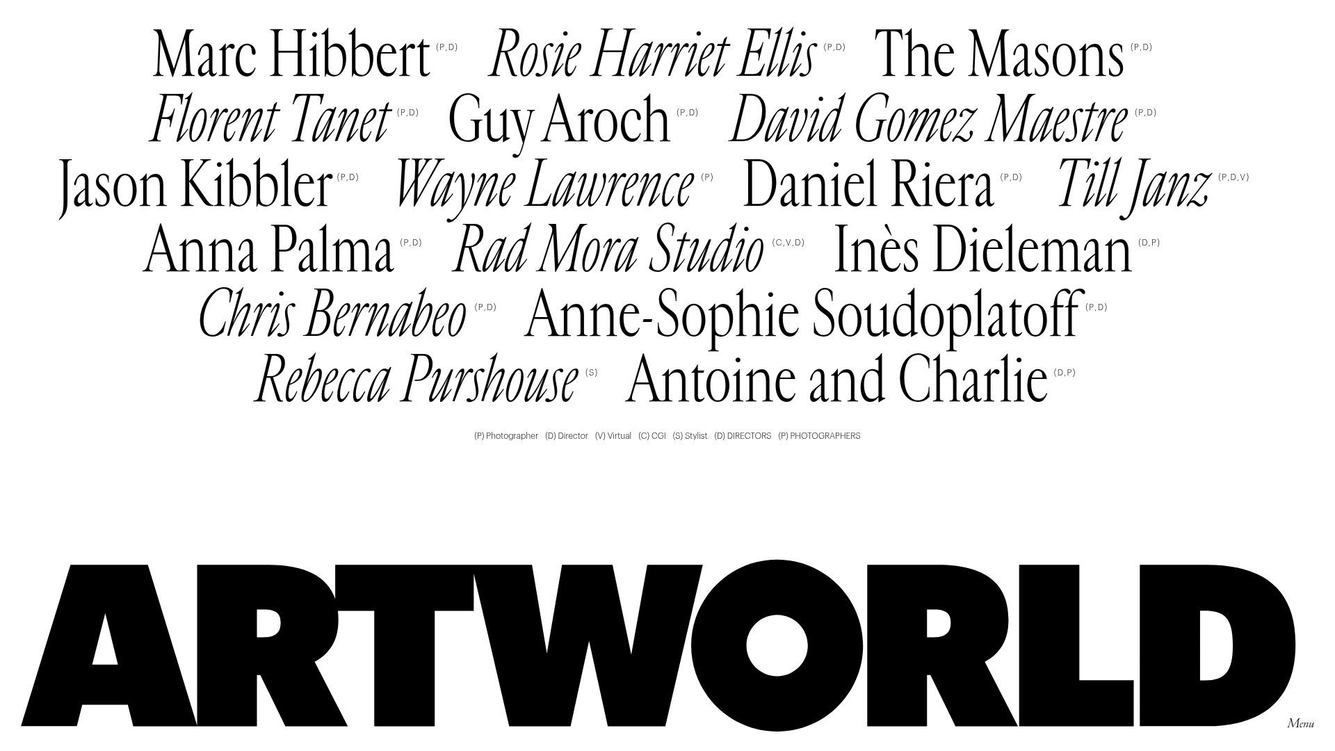
Artworld Agency Artist Portfolio Directory
A minimalist creative agency landing page featuring a typographic artist cloud, interactive category filtering, and image-on-hover card reveals in a clean, high-contrast layout.
