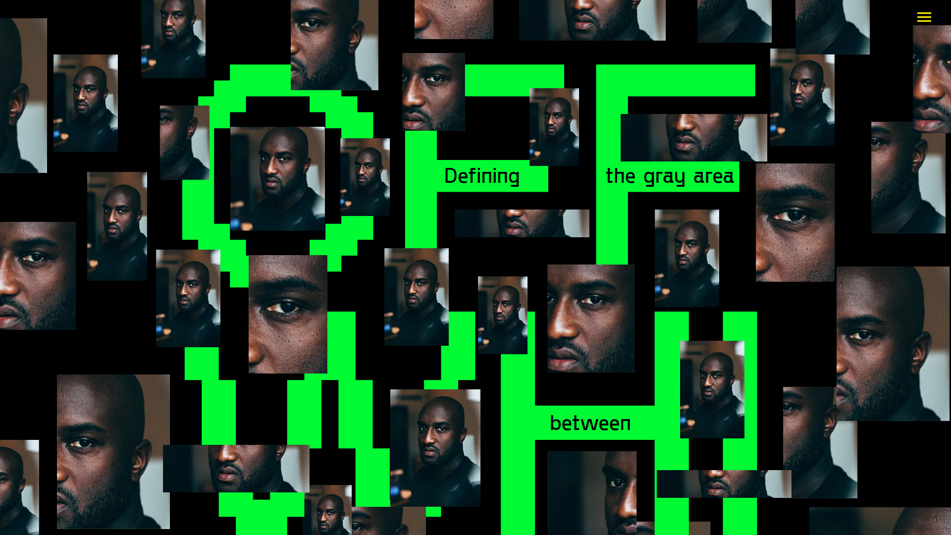
Off-White Inspired Experimental Collage Layout
A high-concept landing page featuring a mosaic of image fragments over stylized neon typography with vertical text alignment and unique grid overlaps.
Overview
This project is a high-concept, experimental landing page that pays homage to the Virgil Abloh 'Off-White' aesthetic. It utilizes a complex multi-layered grid to combine pixelated neon typography with a chaotic mosaic of photographic fragments, making it an excellent reference for builders wanting to master unconventional layout overlaps and anti-design principles.
Design System
- Color Palette & Visual Hierarchy: The palette is stark and high-contrast, utilizing a solid black background (#000000) with a vibrant 'Neon Green' (#00FF00) for primary typography. The visual hierarchy is intentionally fragmented, using the large, blocky text to anchor a scattered array of image assets.
- Typography system: A monospace, sans-serif font is used for the header text ("Defining the gray area between"). The larger background letterforms ('OFF-WHITE' or 'OFF') are rendered in a pixelated, block-style typeface that acts more as a structural element than legible text.
- Page Structure & Section Flow: The layout operates on a complex grid where image containers (various rectangular crops of a subject's face) are positioned at different z-indices and offsets. This creates a collage effect where images often overlap or are clipped by the neon letterforms.
- Reusable Components: The most valuable component to clone is the 'Mosaic Image Container'—a system for placing various aspect-ratio thumbnails across a viewport. The site also features a minimalist hamburger menu icon in the top right corner for navigation.
- Interaction and Motion: Based on the visual structure, the layout suggests a 'broken' grid interaction where elements might shift slightly or reveal hidden layers. The focus is on the interplay between the typography and the photographic 'bits'.
- Implementation Clues: The HTML structure indicates a heavy use of absolute and relative positioning to achieve the 'cluttered' look. Images are individual
<img>or background-image elements spread across a container div that spans the full viewport height and width.
Use Cases
- Who should clone this: Creative directors, editorial designers, and front-end developers building portfolio sites, high-fashion lookbooks, or experimental digital art pieces.
- Effective Remixes: This layout effectively serves music label landing pages, streetwear collection drops, or digital exhibition galleries.
- Remix Directions: Replace the repetitive face fragments with product shots for an e-commerce hero section, or swap the neon green for metallic or pastel tones to shift the brand mood while keeping the structural complexity.
- Suggested Clone Scope: Start with a 'Quick Section Clone' of the typography-image overlap mechanics. The full-page clone is best used for single-page 'link in bio' style landing pages where visual impact outweighs dense information architecture.
Related Inspirations

Infringe Hair Culture Portfolio Gallery
A minimalist, high-impact portfolio featuring a vertical sticky marquee sidebar and full-screen image scrolls that toggle between desktop and mobile assets.
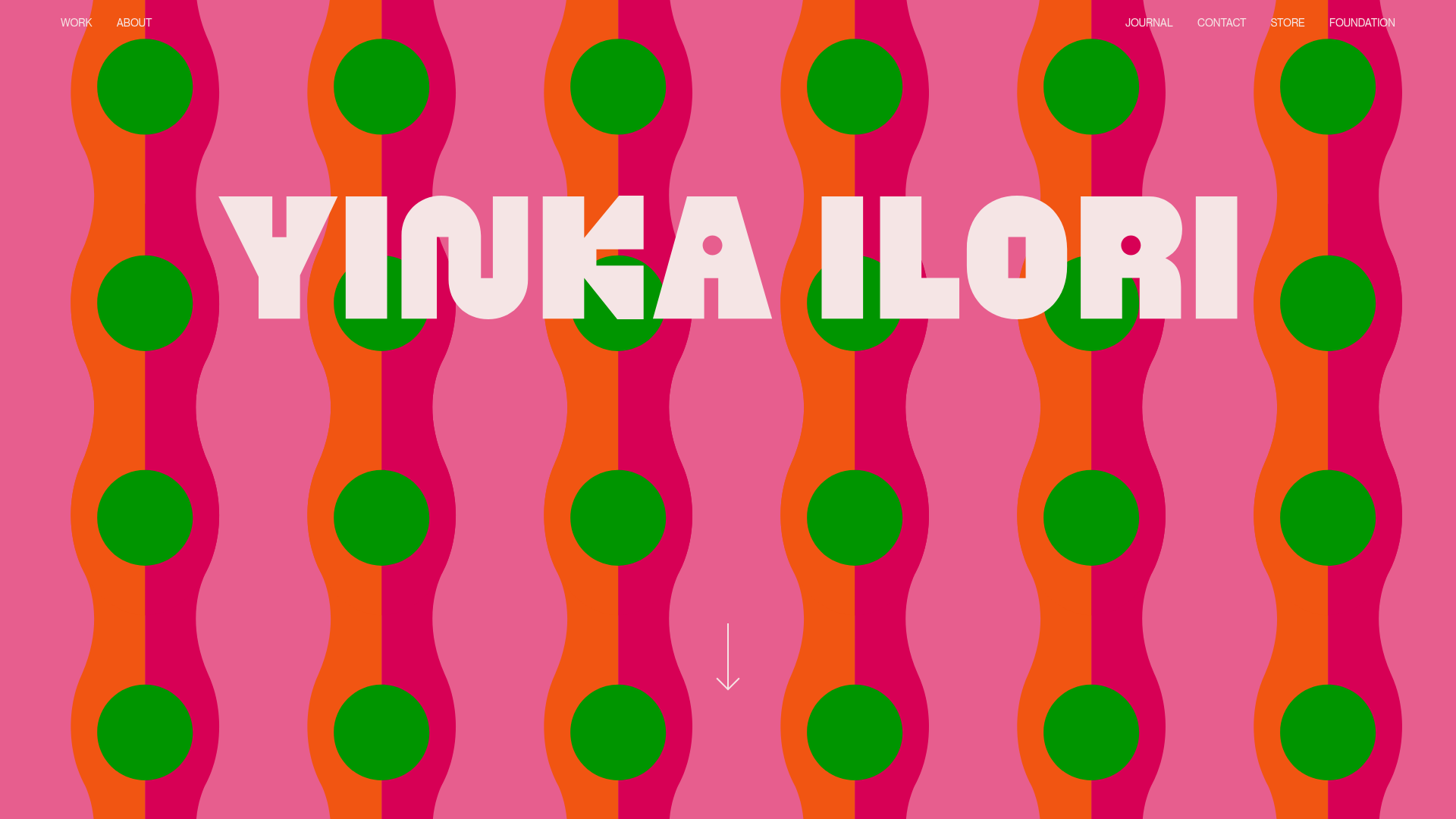
Yinka Ilori Portfolio Mosaic Grid
A vibrant portfolio featuring a scroll-activated parallax hero, bold typography, and a staggered mosaic image grid with asymmetric layouts and fade-in animations.
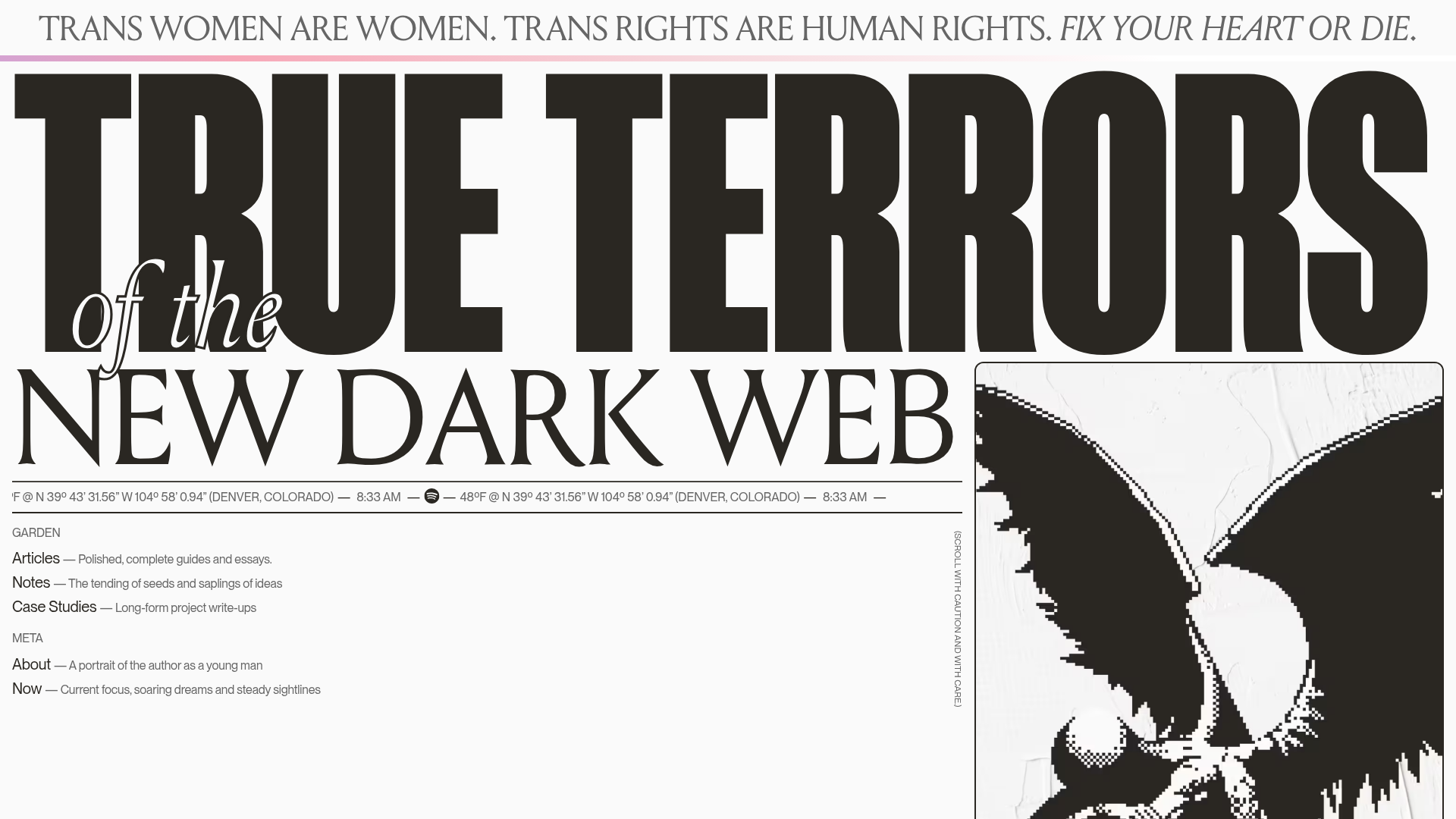
True Terrors Creative Developer Portfolio
A high-impact typography-driven portfolio featuring marquee animations, custom grid overlays, horizontal scroll case study rows, and a brutalist digital garden layout.
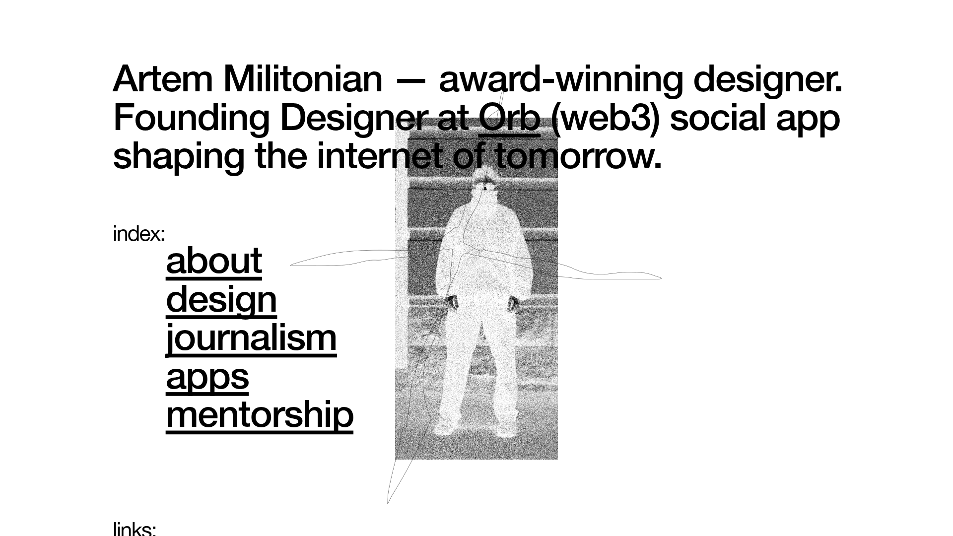
Artem Militonian Portfolio Landing Page
A minimalist, typography-focused designer portfolio featuring a layered grayscale hero image, staggered vertical navigation links, and a fixed header with utility data.
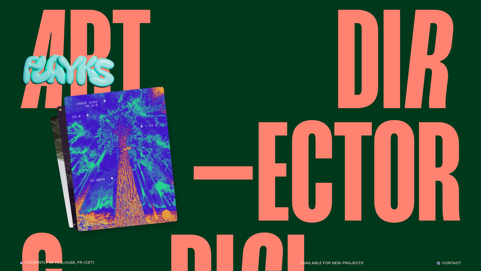
Flayks Digital Portfolio with Floating Cards
A high-end creative portfolio featuring an overlapping card stack hero, complex typography animations, and modular project showcase sections with Svelte-based interactive components.
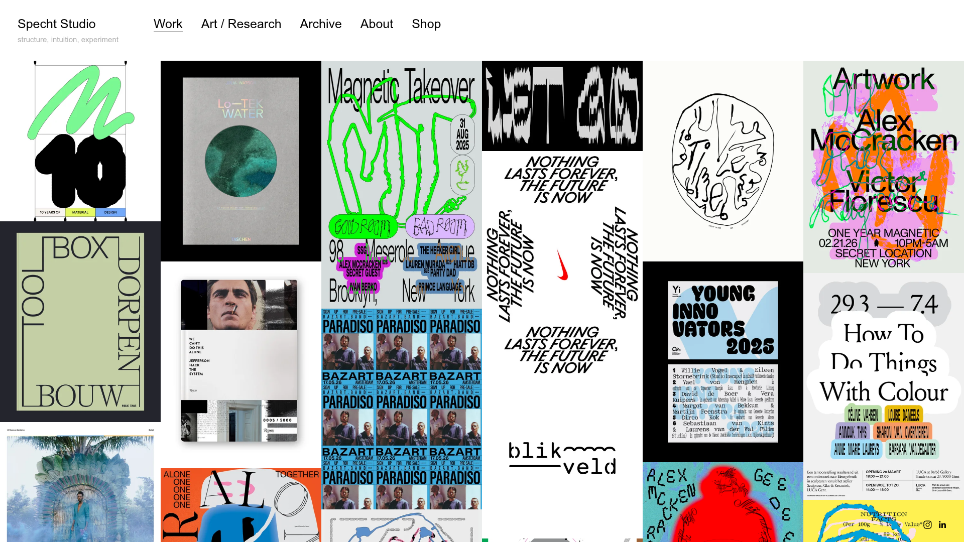
Specht Studio Portfolio Masonry Grid
A minimalist graphic design portfolio featuring an irregular masonry image gallery with high-contrast typography, hidden project details, and a top-aligned persistent navigation bar.
