Hardclo Brutalist E-commerce Lookbook
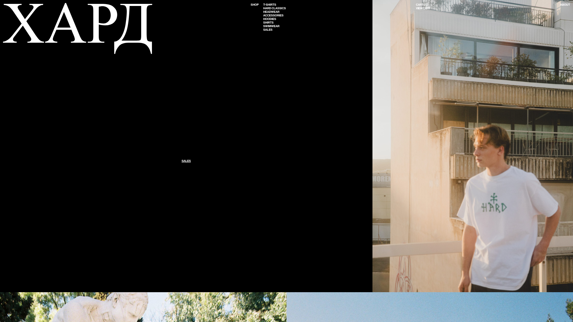
A minimalist apparel site featuring a split-screen hero layout, asymmetric image grids, a side-aligned vertical menu, and an oversized typography header.
Overview
Hardclo is a high-fashion streetwear e-commerce site that utilizes a brutalist, editorial-first layout to showcase its collections. It is a premier reference for builders looking to break away from standard retail grids in favor of a lookbook-style experience that prioritizes large-scale imagery and unorthodox navigation.
Design System
- Color Palette & Visual Hierarchy: The site uses a high-contrast monochromatic base (pure black #000000 and white) to serve as a canvas for high-saturation photography. Hierarchy is established through extreme scale, with massive typographic headers contrasting against thin-stroke UI elements.
- Typography: The primary brand identity uses a large-scale, serif Cyrillic-inspired font (seen in the "XAPД" header). Navigation and shop categories utilize a sans-serif, uppercase typeface with tight letter spacing for a utility-focused, industrial aesthetic.
- Page Structure: The layout starts with a split-screen hero section (left: black void/navigation; right: vertical-oriented product photography). This transitions into a modular vertical scroll consisting of symmetric dual-image splits and full-width landscape image blocks.
- Reusable Components:
- Side-Aligned Multi-Column Nav: A minimal list of categories (T-Shirts, Hoodies, etc.) anchored to the top-center.
- Marquee Ticker: A continuous horizontal scrolling text component used for store location announcements.
- Section Halves: Flexible
section__item__halfcontainers that maintain consistent margins regardless of image aspect ratio.
- Interaction Patterns: The design features a slide-out "mini-cart" sidebar and a persistent top-right navigation bar for secondary links (About, Cart). The marquee demonstrates a CSS-driven infinite animation loop.
- Implementation Clues: The HTML structure reveals a WordPress/WooCommerce backend primarily using custom CSS classes like
.hero__holder,.section__item, and.ticker. It avoids heavy frameworks in favor of a clean, block-oriented div structure.
Use Cases
- Target Audience: Developers of independent fashion labels, art photographers, or creative agencies looking for a non-traditional portfolio or boutique storefront.
- Remix Directions: Replace the black hero void with a secondary image for a more vibrant entry, or swap the oversized serif branding for a bold grotesque font to pivot from "high-fashion" to "tech-wear."
- Practical Adaptations: The asymmetric image grid sections (
.section__item) can be cloned as standalone gallery components for any site that needs to show high-resolution vertical assets without a rigid grid. - Clone Scope: A full-page clone is recommended to capture the specific balance between the empty space in the hero and the density of the lower sections.
Related Inspirations
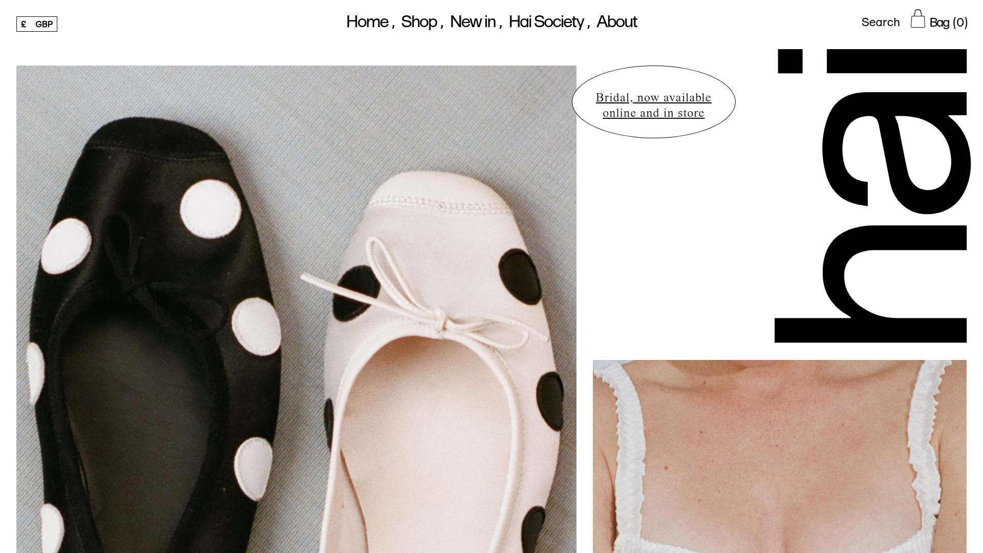
Hai Fashion E-commerce Product Grid
Minimalist boutique layout featuring asymmetrical product imagery, specialized typography, a floating circular call-to-action, and a clean grid for showcasing apparel and accessories.
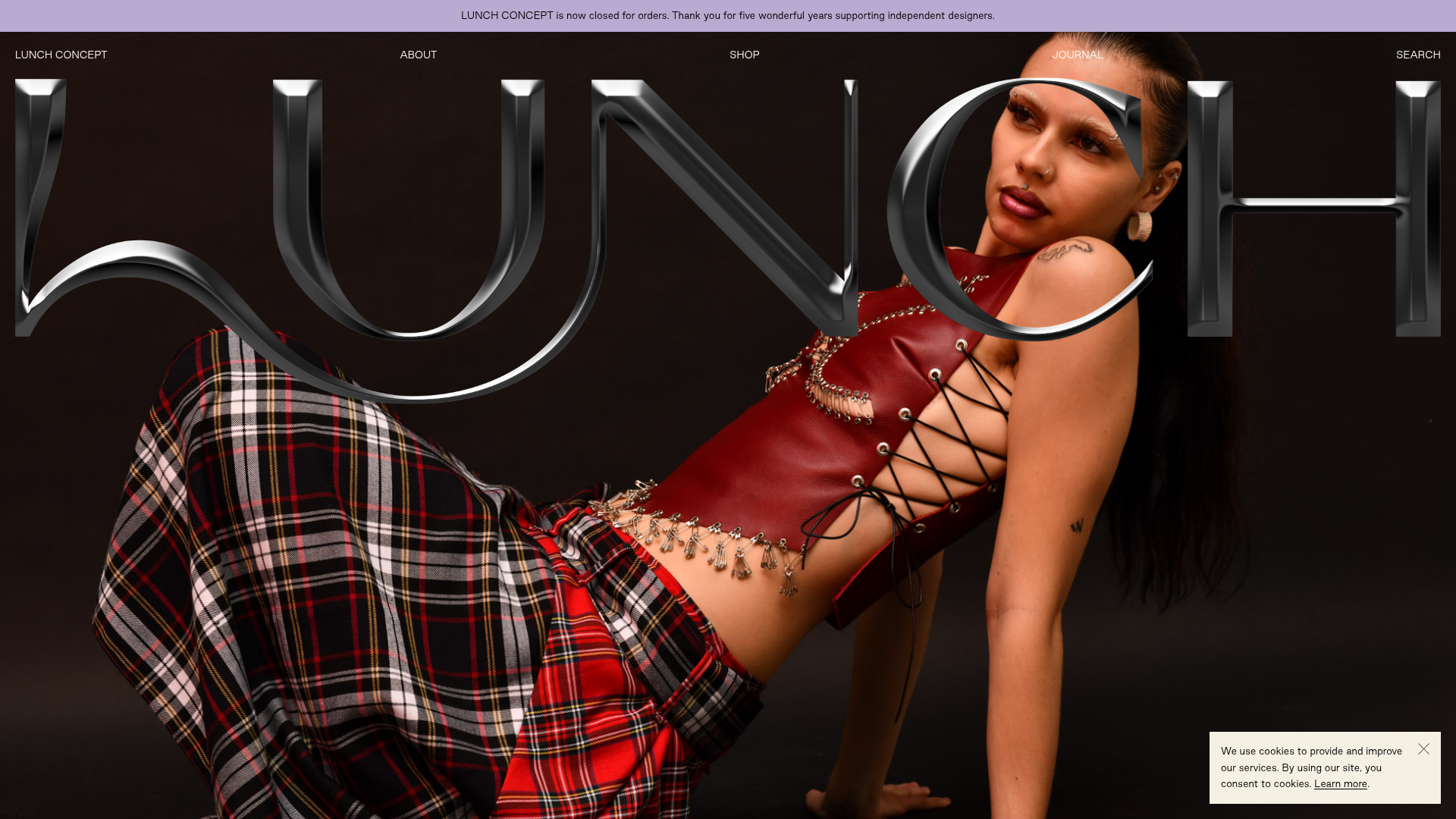
Lunch Concept Fashion E-commerce Showcase
A minimalist fashion store featuring a full-width chrome-effect typography overlay, high-impact hero imagery, and a clean product grid with hover-state image swapping.
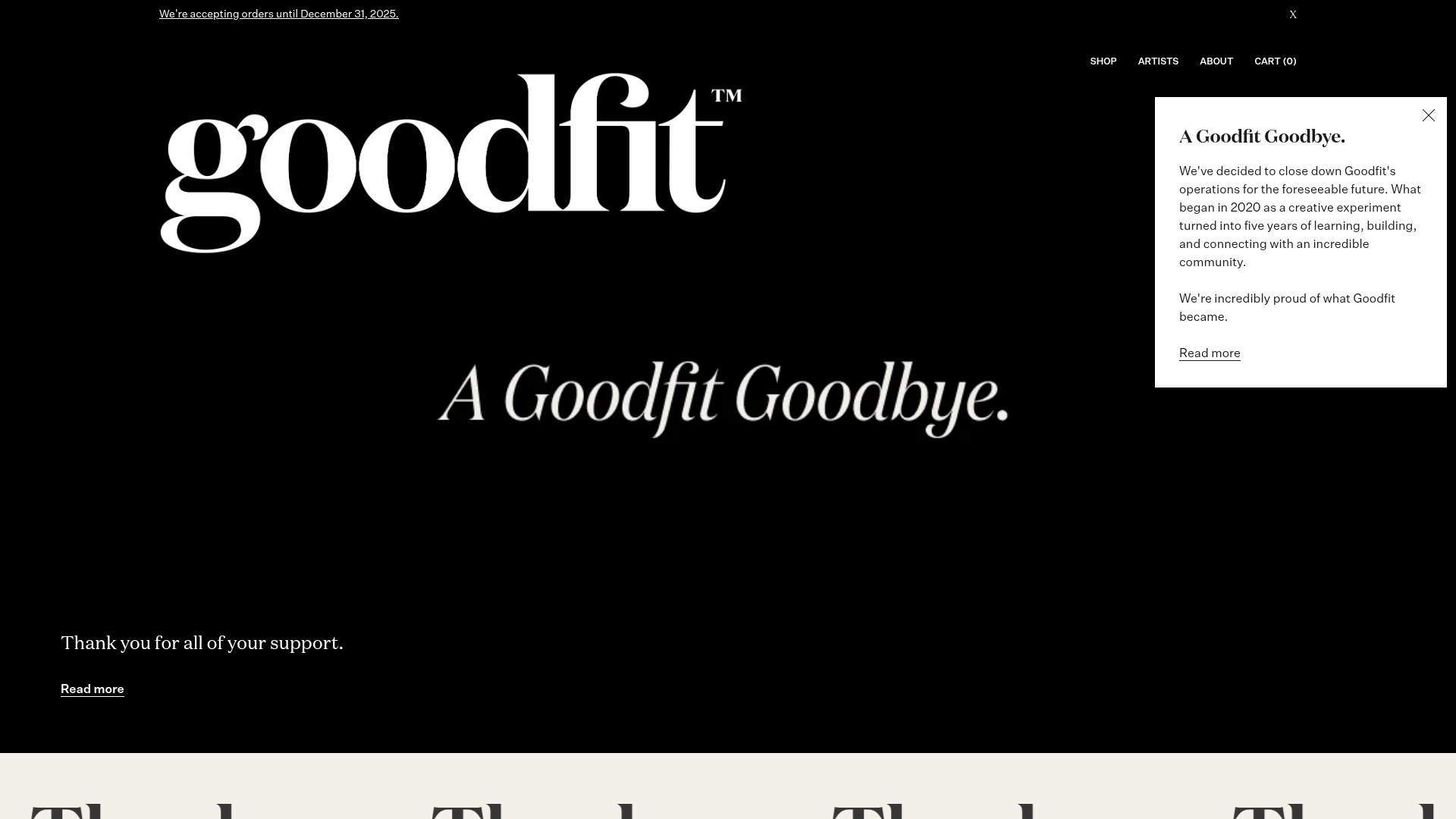
Goodfit E-commerce Puzzle Landing Page
A dark-themed Shopify storefront featuring a bold serif hero, scrolling marquee, tabbed product grids, and asymmetrical rich text blocks with image-led storytelling.
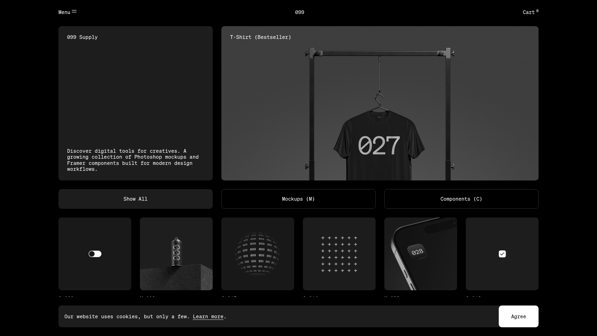
099 Supply Minimalist Bento Asset Gallery
A dark-themed asset store featuring a bento grid layout, video-on-hover card interactions, and category filters for digital products and Photoshop mockups.
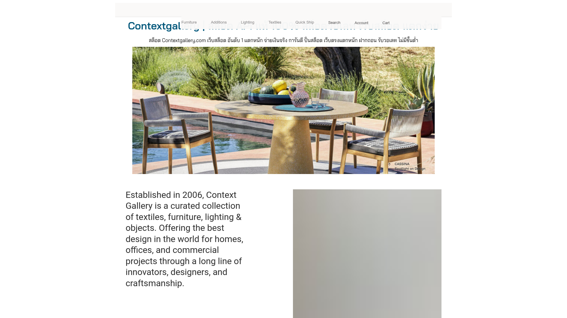
Context Gallery High-End Furniture Landing Page
A minimal editorial layout featuring a multi-column product carousel, designer biographies with image-text pairings, and a magazine-style content grid for curated design stories.
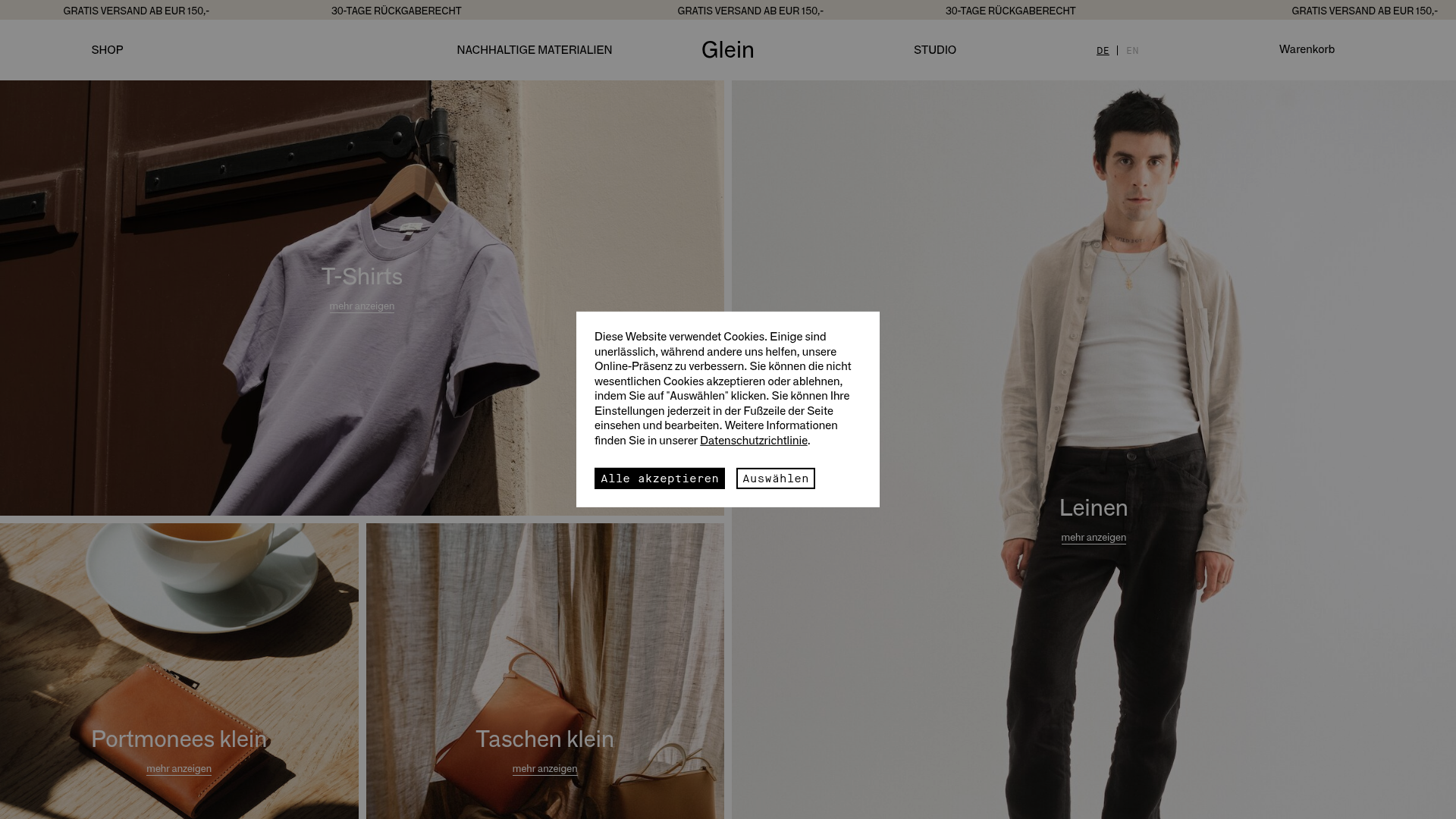
Glein Minimalistic Bento Grid eCommerce
A clean, modular layout using a bento-style responsive grid of text teasers and large-scale product imagery for lookbooks and collection browsing.
