Nomen Nescio Minimalist E-commerce Layout
A clean Shopify store design featuring a full-width slideshow hero, balanced bento-style feature grids, and a minimalist product list with hover-triggered image states.
Overview
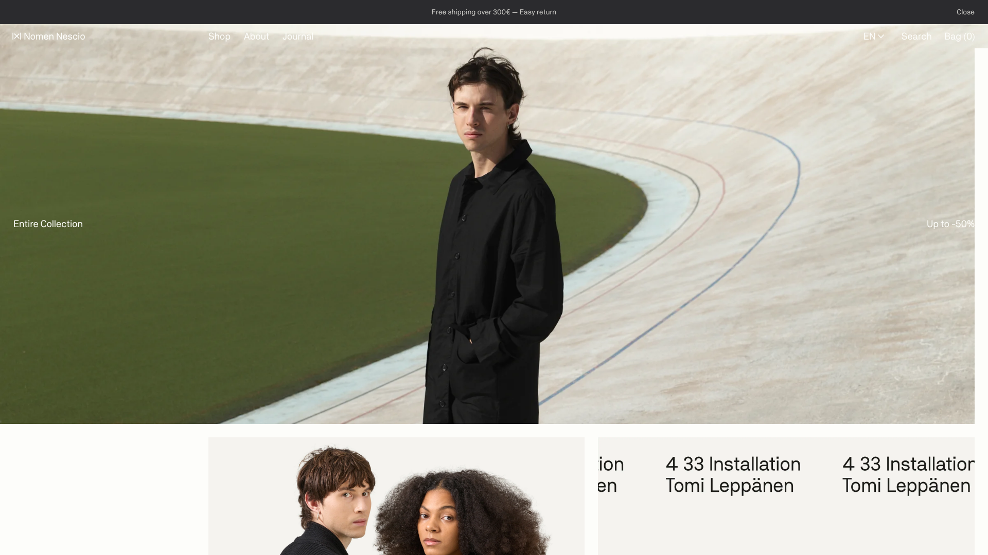
This Shopify storefront for Nomen Nescio is a masterclass in high-fashion minimalist e-commerce, utilizing a monochromatic palette and generous white space to emphasize product photography. It effectively balances a cinematic full-width hero section with a structured, asymmetric bento-style navigation grid, making it an excellent reference for builders seeking an "editorial" look for premium brands.
Design System
- Color Palette & Visual Hierarchy: The design is strictly monochromatic, using
#FFFFFFbackgrounds and#000000text. Hierarchy is established through image scale rather than color, with a clear "anti-clutter" approach that removes all non-essential borders and shadows. - Typography System: A clean, high-contrast sans-serif is used throughout. Headers and navigation items use a consistent, medium-weight font with tight leading. Product titles on the grid include a unique "Code + Full Name" format (e.g., "154 Loose Parka Coat") to reinforce a utilitarian, archival aesthetic.
- Page Structure & Section Flow:
- Utility Bar: Slim, dark announcement bar for site-wide alerts.
- Minimalist Header: Transparent on hero, featuring spread-out navigation links and right-aligned functional icons (Search, Bag).
- Slideshow Hero: A full-width
flickity-enabledcarousel using large-scale environmental photography. - Bento Feature Grid: A flexible 2x2 grid using
.features--block.size-halfclasses for category navigation. - Product List: A dense, multi-column grid featuring high-aspect-ratio portrait photography.
- Reusable Components:
- Product Card: Features a
stickerfor discounts and a complexproduct-item--imagesstack for hover interaction. - Asymmetric Grid: The transition from full-width to half-width containers creates a rhythmic visual flow.
- Product Card: Features a
- Interaction & Motion: The primary interaction is the hover-triggered image state. In the product grid, hovering over a card cycles through a stack of alternative product angles (visible in the HTML as a series of
first-falseimage classes). The hero uses aflickityfade transition (carousel--fadeIn). - Implementation Clues: The site uses Shopify's section-based architecture. Images are served using a dual-loading strategy (
loresfor speed andhiresfor clarity), and some product cards integrate auto-playing MP4 videos for dynamic previews.
Use Cases
- Who should clone this: Designers building for luxury apparel, high-end furniture, or niche architectural products where the brand identity is synonymous with "organized minimalism."
- Effective Remixes: This layout is perfect for brands with high-quality, consistent photography. If your product line is diverse or colorful, the minimalist container will act as a neutral frame to make those colors pop.
- Practical Remix Directions:
- Swap Brand Style: Keep the structure but replace the monochromatic theme with earthy tones for an organic lifestyle brand.
- Adapt Info Architecture: The
4 33 Installationblog/journal section (visible in text overlay) shows how to mix editorial content directly into a shop-first grid.
- Suggested Clone Scope: Start with the Product Card Hover Effect (image stacking) and the Asymmetric Feature Grid. These are the most distinctive functional elements. A full-page clone is best for stores with low SKU counts and premium price points.
Related Inspirations

Context Gallery High-End Furniture Landing Page
A minimal editorial layout featuring a multi-column product carousel, designer biographies with image-text pairings, and a magazine-style content grid for curated design stories.

Glein Minimalistic Bento Grid eCommerce
A clean, modular layout using a bento-style responsive grid of text teasers and large-scale product imagery for lookbooks and collection browsing.

Isla Beauty Skincare E-commerce Store
A clean Shopify-based storefront featuring a split-hero landing page, a step-by-step product system carousel, and a split-screen testimonial section with localized product image sidebars.

Stojo Collapsible E-commerce Storefront
A Shopify layout featuring a prominent discount modal, mosaic grid hero sections, and clean product cards with integrated color swatches and quick-buy functionality.

Basic.Space E-commerce Gallery Clone
A minimalist product marketplace featuring a clean sticky navigation bar, nested flyout menus, and a horizontally scrollable product carousel with hover-state image switching.

Ashley & Co Lifestyle E-commerce
An elegant Shopify-based storefront featuring a split-screen animated hero, horizontal ticker-tape collection carousel, and dynamic mega-menus with scent-specific color switching and image previews.
