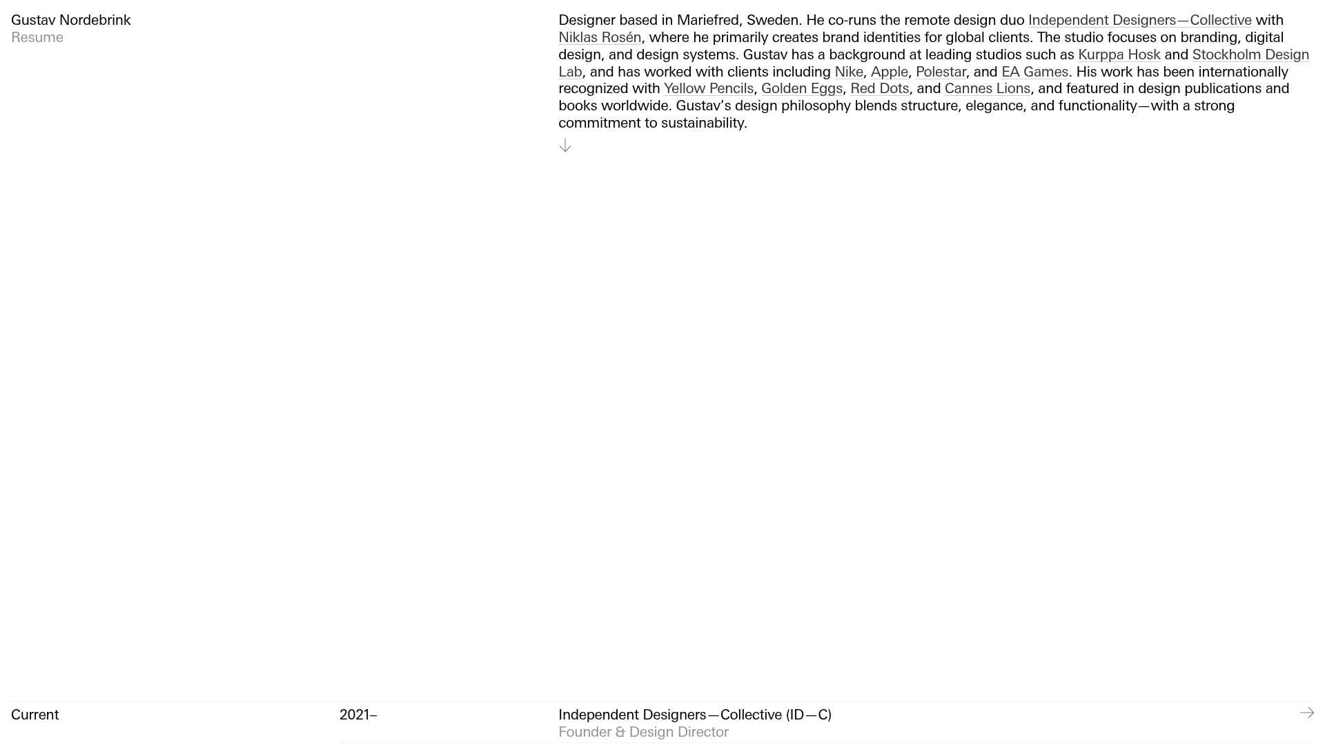
Gustav Nordebrink Portfolio Resume Sidebar
A minimalist, text-focused resume layout featuring a sticky sidebar with bio and a structured multi-column grid for experience, awards, and project archives.
Overview
Gustav Nordebrink’s portfolio is a high-performance reference for a text-first, editorial-style resume. It utilizes a sophisticated multi-column grid that balances heavy data density with ample whitespace, making it a perfect clone for professionals with extensive accolades and experience who want a clean, brutalist-lite aesthetic.
Design System
- Color Palette & Visual Hierarchy: The site follows a strict achromatic theme, using a high-contrast black and white base. Hierarchy is established through grayscale variations (
color-gray-1for secondary metadata) and font weight rather than color. - Typography System: The design relies on a clean, humanist sans-serif. It uses a "small caps" feel for headers and consistent point sizes across the table-style rows. Bold weights are reserved for primary titles (e.g., Company or Award names) to guide the scanning eye.
- Page Structure & Section Flow: The layout is divided into a fixed-height introduction followed by a vertically scrolling resume content area (
#experience). Sections are organized intoexperience-blockcontainers which are divided using acolumnsgrid: a narrow left column (3-unit width) for section labels (Current, Education, Awards) and a wide right column (9-unit width) for chronological data. - Reusable Components:
- Experience Rows: These
experience-rowanchor tags are the core building blocks, utilizing nested columns to align years, titles, roles, and project sites perfectly across different screen sizes. - Sidebar Bio: The sticky top/side layout for the bio text provides constant context while scrolling through the dense list of details.
- Experience Rows: These
- Interaction & Motion: The links feature subtle hover states and arrow indicators (
→) on the right edge of rows, signaling clickability despite the minimalist appearance. - Responsive Behavior: The HTML includes mobile-specific utility classes like
col-s-1andtype-mobile-small, indicating a collapse strategy where the multi-column desktop layout stacks or simplifies into more traditional list rows for smaller viewports. - Implementation Clues: The structure uses a custom grid system (
columns,col-3,col-9) likely built with Flexbox or CSS Grid, prioritizing semantic nesting within<main>and<section>tags.
Use Cases
- Who should clone this pattern: Creative directors, academic researchers, or developers who need to present a long list of credits, awards, and technical history without overwhelming the viewer.
- Remixing for other products: This pattern works exceptionally well for project archives, documentation indices, or even detailed pricing tables for SaaS products where feature comparisons need high legibility.
- Remix Directions: Swap the high-contrast black for a deep navy or warm parchment to soften the look, or adapt the information architecture by replacing the "Year" column with "Category" tags for a non-chronological portfolio.
- Suggested Clone Scope: A full-page clone is ideal for a dedicated "About" or "CV" page, while the
experience-rowcomponent is a valuable micro-clone for adding an "As Seen On" or "Awards" section to a standard landing page.
Related Inspirations

Baubauwerk Minimal Agency Portfolio Homepage
A clean studio site featuring a centered text hero, scatter-plot filterable project gallery, and full-bleed image sections for case studies.
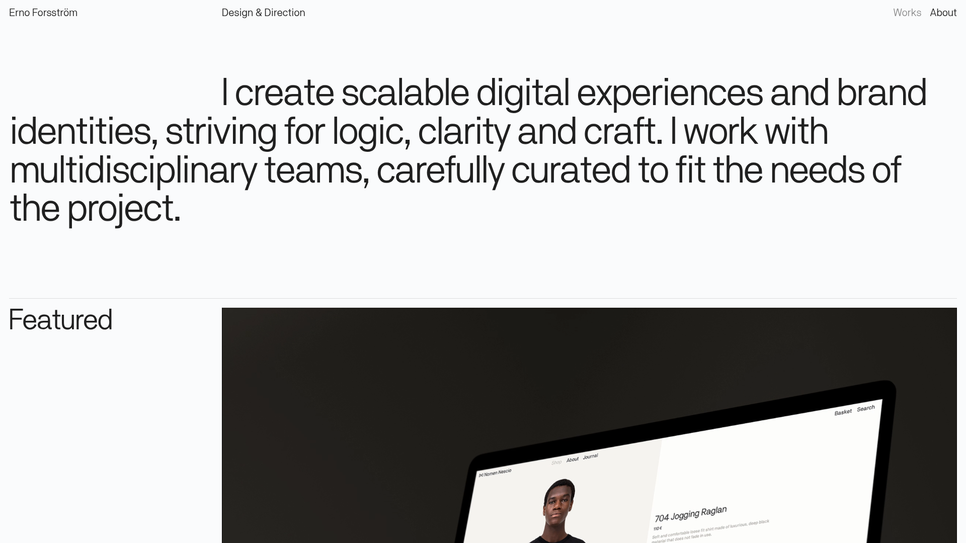
Erno Works Minimalist Design Portfolio
A clean, typography-focused portfolio featuring a sticky grid layout, large editorial headers, and integrated video project thumbnails for dynamic case study previews.
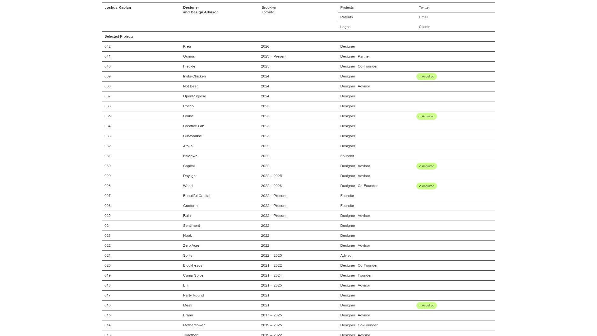
Joshua Kaplan Portfolio Index
A minimalist, text-only portfolio layout featuring an expansive tabular list of projects with horizontal rule separators and clean typography.
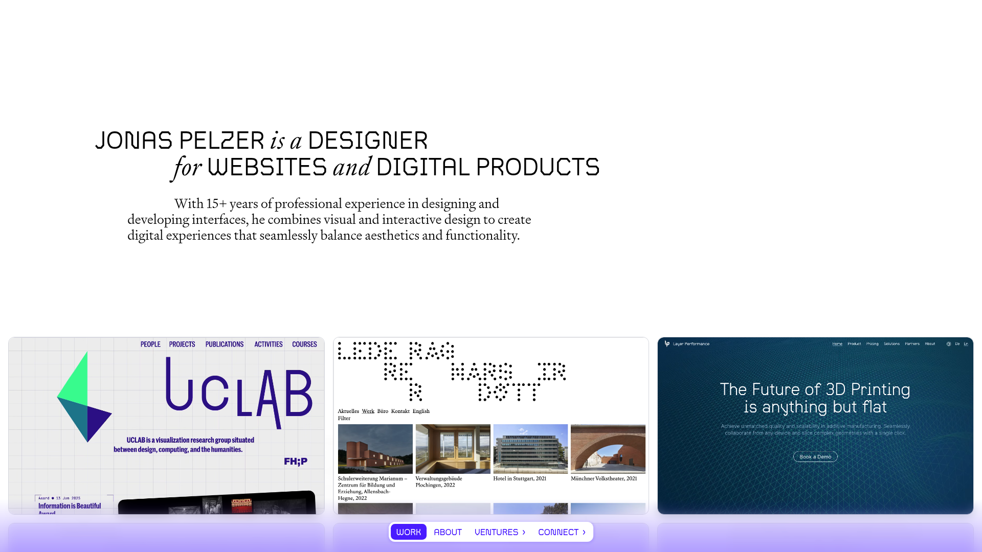
Jonas Pelzer Portfolio Showcase
A minimalist design portfolio featuring a large typography hero, a staggered video project grid, and a sticky tab-based navigation bar for content switching.
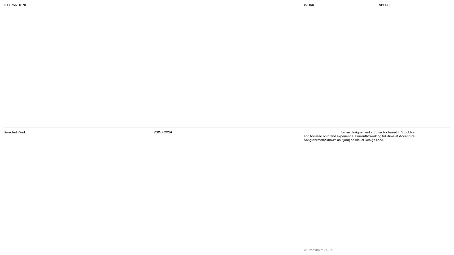
Gio Pandone Minimalist Portfolio Template
A clean, grid-based designer portfolio featuring a sticky minimalist navigation, scroll-triggered entrance animations, and a responsive 12-column work gallery with embedded video previews.
Minimalist Typography Portfolio and Services Grid
A clean, serif-heavy layout featuring an A-Frame 3D hero animation, tiered service lists, and a modular multi-column text structure for design manifestos.
