Tiqets Travel Experience Booking Marketplace
A travel booking portal featuring a large hero search area, a three-column trust badge section, and horizontal scrolling category tabs with card-based product listings.
Overview
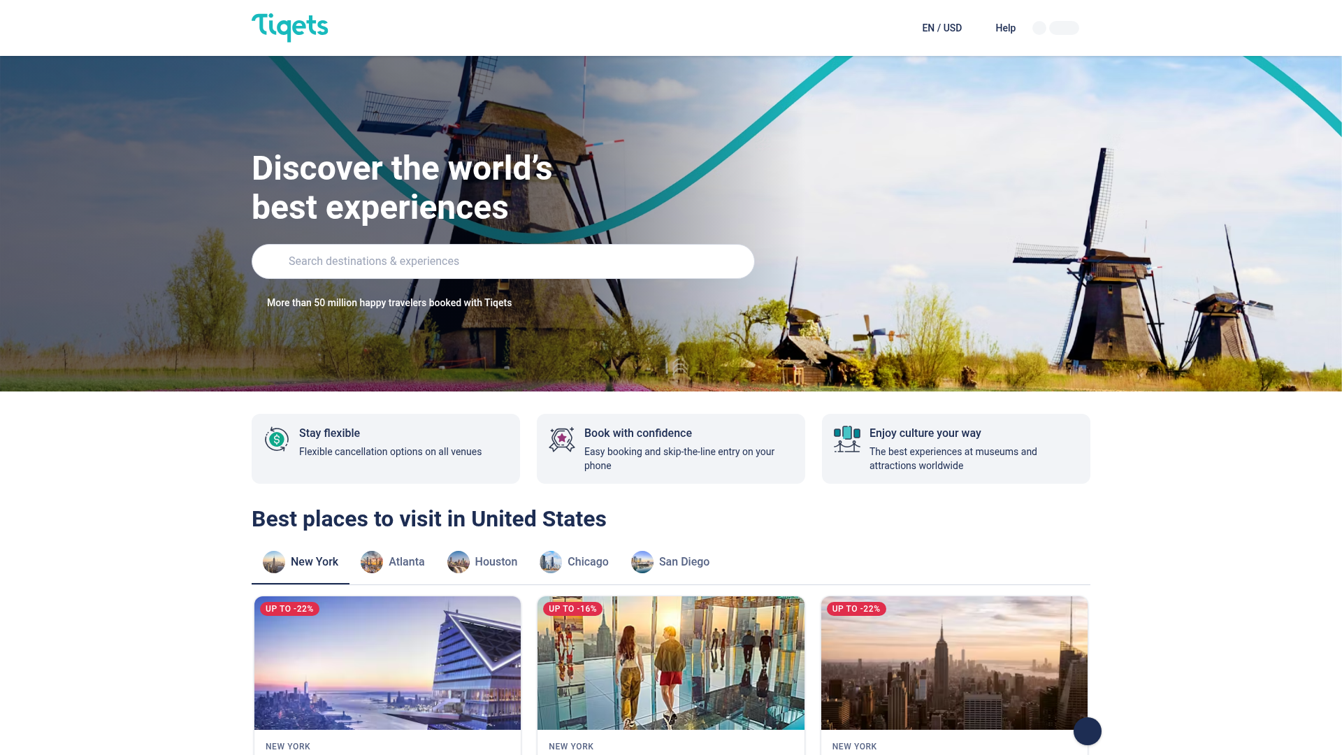
Tiqets is a high-conversion travel and experience booking marketplace that excels at presenting complex inventory through a clean, intuitive interface. It is an excellent clone reference for any directory-style application that needs to balance a powerful search-first user experience with trust-building elements and discovery-based content grids.
Design System
- Color Palette & Visual Hierarchy: The site uses a clean, high-contrast palette. A deep navy/ink (
#1D2D52) is used for primary text and buttons, while a vibrant teal (#00818A) serves as the brand accent. Backgrounds are primarily white or light grey (#F4F4F4), ensuring that colorful product imagery in cards and the hero section remains the focal point. - Typography: The system relies on a bold sans-serif scale. Headings use
text-heading-lgandtext-heading-mdclasses for clear section breaks. A sophisticated touch is the use of uppercase, tracked-out micro-copy for city labels (e.g., "NEW YORK"), creating a professional, editorial feel. - Page Structure & Section Flow: The layout follows a classic marketplace funnel: 1) Huge hero with a search bar for high-intent users, 2) Horizontal trust/value proposition bar, 3) Tabbed category navigation for discovery, and 4) Horizontal scrolling product cards.
- Reusable Components:
- Search Hero: A full-width relative container with a
picturetag for responsive art direction and a rounded-full input field. - Trust Badges: A three-column grid featuring simple SVG icons and two-line text blocks to reduce bounce rates.
- Category Tabs: Pill-style tabs with circular avatars (
rounded-full) that use an underline indicator (bg-primary-text) for the active state. - Discount Badges: Red, high-visibility corner labels (
bg-red-600) positioned absolutely within card image containers.
- Search Hero: A full-width relative container with a
- Interaction & Motion: The implementation uses
card-hover-animationfor subtle lifting effects. The product sliders feature absolute-positioned navigation buttons that appear only when relevant, and tabs likely use HTMX for asynchronous content swapping as evidenced byhx-targetandhx-getattributes in the HTML. - Implementation Clues: The site heavily utilizes Tailwind CSS utility classes (e.g.,
flex,grid-flow-col,snap-x,isolate). It also integrates HTMX for lightweight dynamic updates, making it a great reference for developers wanting to build interactive UIs without heavy JavaScript frameworks.
Use Cases
- Who should clone this: Developers building localized city guides, event booking platforms, or boutique hotel aggregators.
- Remix Directions:
- Real Estate: Swap the experience cards for property listings, utilizing the "up to -X%" badge for "Price Reduced" alerts.
- E-commerce: Adapt the tabbed city section to show "Trending Categories" or "New Arrivals" with circular icons representing product niches.
- Professional Services: Use the trust badge section to highlight certifications and the search hero for finding local consultants.
- Clone Scope: For a quick win, clone the Hero Search + Trust Bar combination. For a full-featured marketplace, the Tabbed Slider Grid is the most valuable architectural pattern to reuse for high-density information display.
Related Inspirations

Context Gallery High-End Furniture Landing Page
A minimal editorial layout featuring a multi-column product carousel, designer biographies with image-text pairings, and a magazine-style content grid for curated design stories.

Glein Minimalistic Bento Grid eCommerce
A clean, modular layout using a bento-style responsive grid of text teasers and large-scale product imagery for lookbooks and collection browsing.

Isla Beauty Skincare E-commerce Store
A clean Shopify-based storefront featuring a split-hero landing page, a step-by-step product system carousel, and a split-screen testimonial section with localized product image sidebars.

Stojo Collapsible E-commerce Storefront
A Shopify layout featuring a prominent discount modal, mosaic grid hero sections, and clean product cards with integrated color swatches and quick-buy functionality.

Basic.Space E-commerce Gallery Clone
A minimalist product marketplace featuring a clean sticky navigation bar, nested flyout menus, and a horizontally scrollable product carousel with hover-state image switching.

Ashley & Co Lifestyle E-commerce
An elegant Shopify-based storefront featuring a split-screen animated hero, horizontal ticker-tape collection carousel, and dynamic mega-menus with scent-specific color switching and image previews.
