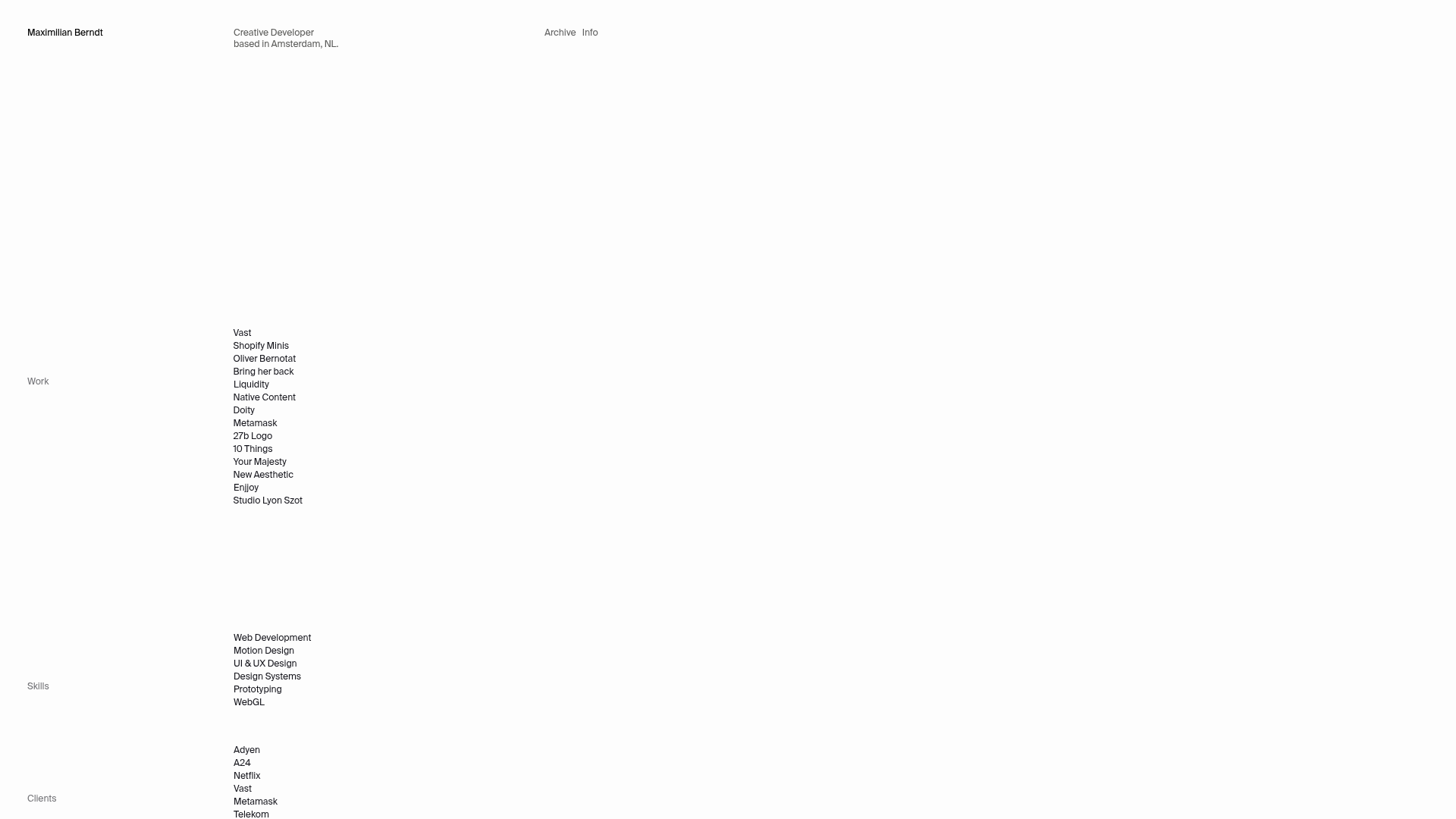
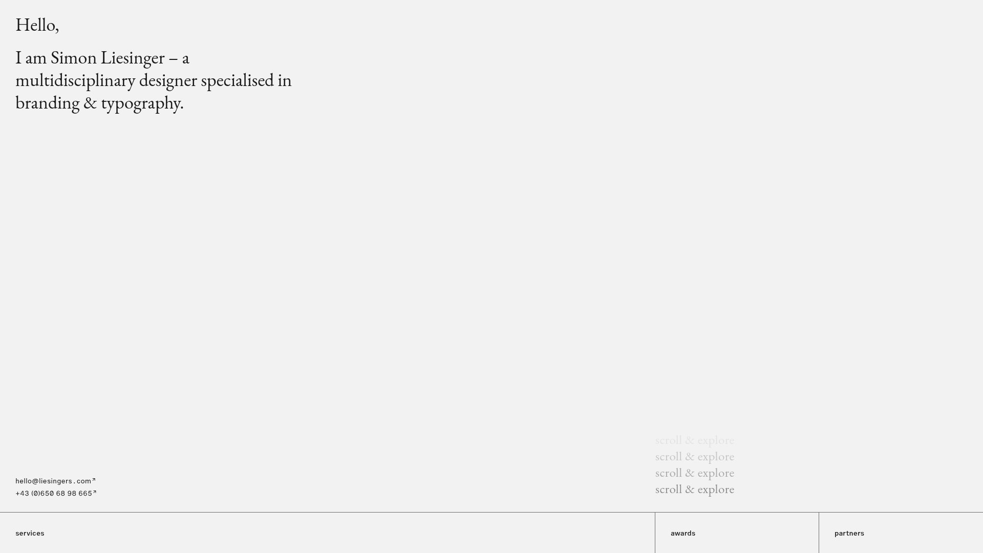
Maximilian Berndt Portfolio Site
A minimalist developer portfolio featuring sticky sidebar navigation, hover-sensitive list interactions with transition effects, and a responsive multi-column grid layout.
Overview
Maximilian Berndt's portfolio is a masterclass in minimalist "brutalist-light" web design, utilizing a stark white canvas and a precise grid system. It is a strong clone reference for its sophisticated use of CSS sticky positioning and hover-triggered micro-interactions that create a sense of depth and activity without visual clutter.
Design System
- Color Palette & Visual Hierarchy: The site uses a high-contrast monochromatic scheme—primary white (
bg-background) with black text (text-foreground) and slate grey (text-grey) for secondary information. Hierarchy is established through generous whitespace rather than font weight or color pops. - Typography: A clean, neutral sans-serif (resembling Inter or Helvetica) is used throughout. The scale is relatively uniform, with small, uppercase-style labels for sections like "Work," "Skills," and "Clients," ensuring equal visual weight across disparate types of content.
- Page Structure: The layout relies on a three-column grid (
md:grid-cols-[120px_280px_1fr]). Section headers (e.g., "Work") are placed in the narrow left column, list items in the center, and the right column serves as a dynamic space for hover-revealed content. - Reusable Components:
- Sticky Sidebars: The section labels use
sticky top-64, keeping context visible while browsing long lists. - Interactive List Items: Links feature a custom transition (
-translate-x-14 hover:translate-x-0) that reveals a hidden arrow icon and secondary metadata (like agency names) on hover.
- Sticky Sidebars: The section labels use
- Interaction & Motion: The site uses
ease-quart-in-outtransitions. The primary motion pattern is a horizontal "slide-in" effect for links and a fade-in/scale effect for decorative icons (↗). - Responsive Behavior: On mobile, the grid collapses to a single column, but the header labels (
h3) remain sticky at40svhto maintain the "sliding" navigation feel as the user scrolls through the full-width lists. - Implementation Clues: The site is built using Svelte (indicated by the
svelte-announcerID) and Tailwind CSS, leveraging utility classes likegroup-hover,gap-x-grid-x, andtransition-transformfor its complex animation logic.
Use Cases
- Who should clone this: Creative developers, UI/UX designers, and architects who want a high-end, gallery-like portfolio that prioritizes typography and list-based navigation over large image blocks.
- Effective Remixes: This pattern works well for agency "Services" pages, digital bookshelves, or documentation sites where users need to scan many text items quickly while maintaining visual interest.
- Practical Directions:
- Information Architecture: Swap the "Work" list for a "Product Inventory" or "Press Archive."
- Brand Style: Keep the layout but introduce a dark mode or a single accent color for the hover-reveal metadata.
- Interaction: Reuse the
group-hoverlogic to show project thumbnails in the empty right column instead of just text metadata.
- Clone Scope: A quick section clone of the interactive list is highly valuable for any navigation component; a full-page clone is best for those seeking a complete "Developer Resume" template with a distinct aesthetic.
Related Inspirations

Baubauwerk Minimal Agency Portfolio Homepage
A clean studio site featuring a centered text hero, scatter-plot filterable project gallery, and full-bleed image sections for case studies.
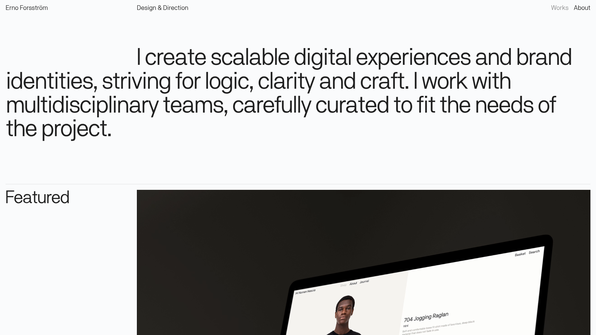
Erno Works Minimalist Design Portfolio
A clean, typography-focused portfolio featuring a sticky grid layout, large editorial headers, and integrated video project thumbnails for dynamic case study previews.
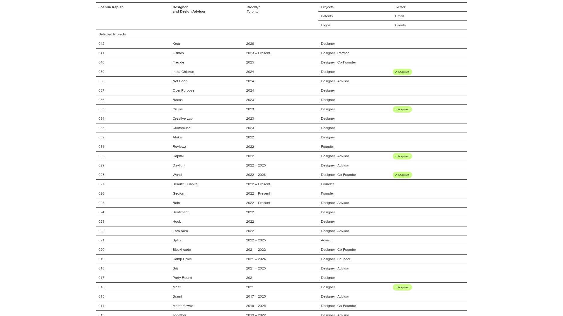
Joshua Kaplan Portfolio Index
A minimalist, text-only portfolio layout featuring an expansive tabular list of projects with horizontal rule separators and clean typography.
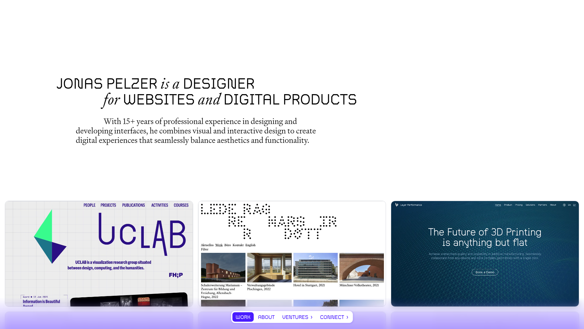
Jonas Pelzer Portfolio Showcase
A minimalist design portfolio featuring a large typography hero, a staggered video project grid, and a sticky tab-based navigation bar for content switching.
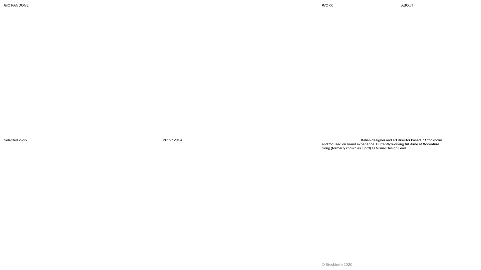
Gio Pandone Minimalist Portfolio Template
A clean, grid-based designer portfolio featuring a sticky minimalist navigation, scroll-triggered entrance animations, and a responsive 12-column work gallery with embedded video previews.
Minimalist Typography Portfolio and Services Grid
A clean, serif-heavy layout featuring an A-Frame 3D hero animation, tiered service lists, and a modular multi-column text structure for design manifestos.
