Pangram Pangram Type Foundry Showcase
A high-end font catalog featuring parallax imagery, interactive font preview cards with hover pangrams, and a versatile tabbed layout for grid or list views.
Overview
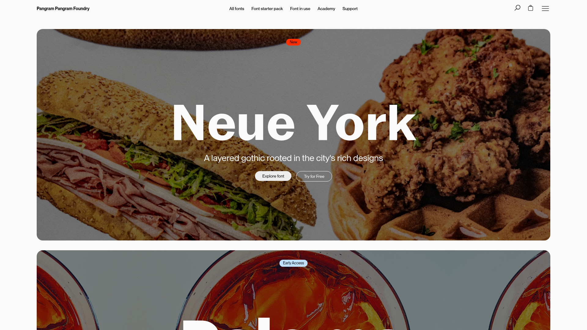
Pangram Pangram’s website is a masterclass in high-end, typography-first e-commerce design. It features a sophisticated blend of large-scale parallax imagery and highly interactive font preview cards, making it an exceptional reference for builders aiming to balance heavy visual content with high performance and technical utility.
Design System
- Color Palette & Visual Hierarchy: The site uses a clean, light-off-white background to provide maximum contrast for its bold typography and vibrant, large-scale photography. Accents of red, blue, and yellow are used sparingly in badges (e.g., "New", "Early Access", "Update") to draw attention without cluttering the interface.
- Typography System: As a type foundry, the typography is the primary hero. The system employs a wide variety of weights and styles, often utilizing variable fonts. Headings use large fluid sizing (up to
16cqion mobile), while secondary information is set in smaller, disciplined sans-serifs to maintain clarity. - Page Structure & Flow: The layout follows a classic vertical stack: a bold hero banner with parallax background imagery and centralized CTA, followed by a "Featured Collection" area with tabbed navigation, then horizontally scrolling swiper carousels for "Fonts in Use" (case studies) and "Academy" (blog content).
- Reusable Components:
- Interactive Font Cards: These cards feature a default character set view that flips to a dynamic "pangram" preview on hover, including a "Check it out" button.
- Tabbed Collection Switcher: A functional toggle between a 4-column "Card View" and a full-width "List View" using Alpine.js (
x-data="tabs"). - Parallax Banners: Image-heavy blocks using custom CSS properties (
--parallax-progress) to drive motion. - Marquee/Carousel: A high-speed logo marquee for "Trusted by" brands and Swiper.js-powered article carousels.
- Interaction & Motion: The site heavily leverages Alpine.js for lightweight interactions. Motion patterns include subtle parallax scrolls on images, smooth tab transitions, and hover-triggered state changes on product cards.
- Implementation Clues: The HTML reveals a Shopify-based architecture optimized with Alpine.js for frontend logic and Swiper.js for touch-friendly horizontal scrolling. Utility-first CSS classes (e.g.,
u-wrapper,p-grid,p-card) indicate a structured, componentized design system.
Use Cases
- Who should clone this pattern: Creative agencies, portfolio-based businesses, or digital product marketplaces that need to showcase high-fidelity assets with interactive previews.
- What products can remix it effectively: A stock photography site could reuse the parallax banners; a theme marketplace or SaaS UI kit seller could adapt the interactive card previews to show code snippets or live component previews.
- Practical remix directions:
- Brand Swap: Replace the minimalist monochrome aesthetic with a brutalist, high-color neon brand style while keeping the tabbed grid/list layout.
- IA Adaptation: Reuse the "Fonts in Use" swiper for a "Customer Testimonials" or "Global Case Studies" section in a B2B context.
- Suggested clone scope: Beginners should start by cloning the Interactive Product Card component. Advanced builders should aim for the Feature-rich Banner system and the Alpine.js-powered tabbed switcher for managing complex product views.
Related Inspirations

Context Gallery High-End Furniture Landing Page
A minimal editorial layout featuring a multi-column product carousel, designer biographies with image-text pairings, and a magazine-style content grid for curated design stories.

Glein Minimalistic Bento Grid eCommerce
A clean, modular layout using a bento-style responsive grid of text teasers and large-scale product imagery for lookbooks and collection browsing.

Isla Beauty Skincare E-commerce Store
A clean Shopify-based storefront featuring a split-hero landing page, a step-by-step product system carousel, and a split-screen testimonial section with localized product image sidebars.

Stojo Collapsible E-commerce Storefront
A Shopify layout featuring a prominent discount modal, mosaic grid hero sections, and clean product cards with integrated color swatches and quick-buy functionality.

Basic.Space E-commerce Gallery Clone
A minimalist product marketplace featuring a clean sticky navigation bar, nested flyout menus, and a horizontally scrollable product carousel with hover-state image switching.
HNST Circular Fashion eCommerce Gallery
A minimalist apparel site featuring a full-screen image slider with parallax effects, grid-based product sections, and a clean typography-focused header for sustainable brand storytelling.
