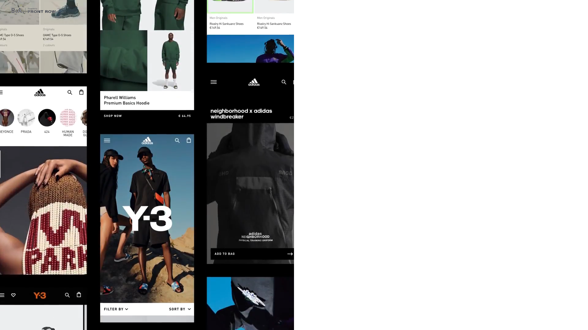
Build in Amsterdam Digital Agency Homepage
A high-end commerce agency site featuring a full-screen video hero, smooth split-screen transitions, and a vertical tiling grid for mobile-responsive project showcases.
Overview
This site is the homepage of 'Build in Amsterdam,' a digital agency specializing in high-end commerce. It is a premier clone reference for its immersive full-screen video integration, grid-based content delivery, and elegant typography that balances minimalist aesthetics with commerce-focused functionality.
Design System
- Color Palette & Visual Hierarchy: The palette is predominantly monochromatic (high-contrast black and white) with a focus on high-quality product imagery and video as the primary driver of color. Content is prioritized using a clear hierarchy: large-scale headers for brand identity followed by smaller monochrome metadata and UI labels.
- Typography System: The design utilizes a bold Sans-Serif font for primary headlines and navigations. A distinctive use of larger-scale typography (e.g., the "Y-3" or the logo branding) provides visual anchor points, while secondary body text and metadata (like prices or shoe names) use a smaller, utility-focused scale.
- Page Structure & Section Flow: The layout follows a vertical scroll strategy. It begins with a split-screen high-impact hero (video on one side, text/CTA on the other), moving into a multi-column product and case study grid where images are hero-sized, and finally into vertical tiling for mobile-responsive sections.
- Reusable Components: Key components for cloning include the split-screen container (HTML
sc-cb1e5195-0), the animated brand tagline container (sc-50569ac5-7), the 'Play Showreel' floating button, and the 'Add to Bag' CTA bars that stick to imagery. - Interaction & Motion: The site features heavy use of transform-based entries (
translateYandtranslateXvisible in the HTML) and visibility toggles on load. Smooth transitions and a custom cursor overlay (cursor-portal-renderer) enhance the agency feel. - Implementation Clues: The HTML indicates a Next.js framework using styled-components (noted by the
sc-class prefixes). Video is served via Mux for optimized streaming, and focus-locking mechanisms suggest a highly accessible modal or menu system.
Use Cases
- Who Should Clone: Portfolio seekers, boutique creative agencies, and high-fashion e-commerce brands looking for a 'lookbook' feel.
- Remix Directions: Swap the monochromatic scheme for bold brand colors to adapt this for a tech startup landing page; alternatively, keep the grid layout but replace agency case studies with product categories for a luxury retail store.
- Suggested Scope: A full-page clone is ideal for those wanting to master complex CSS grid and video hero layouts. However, the 'mobile-first' tiling grid is a perfect quick section clone for anyone needing to display a high volume of visual content without clutter.
Related Inspirations
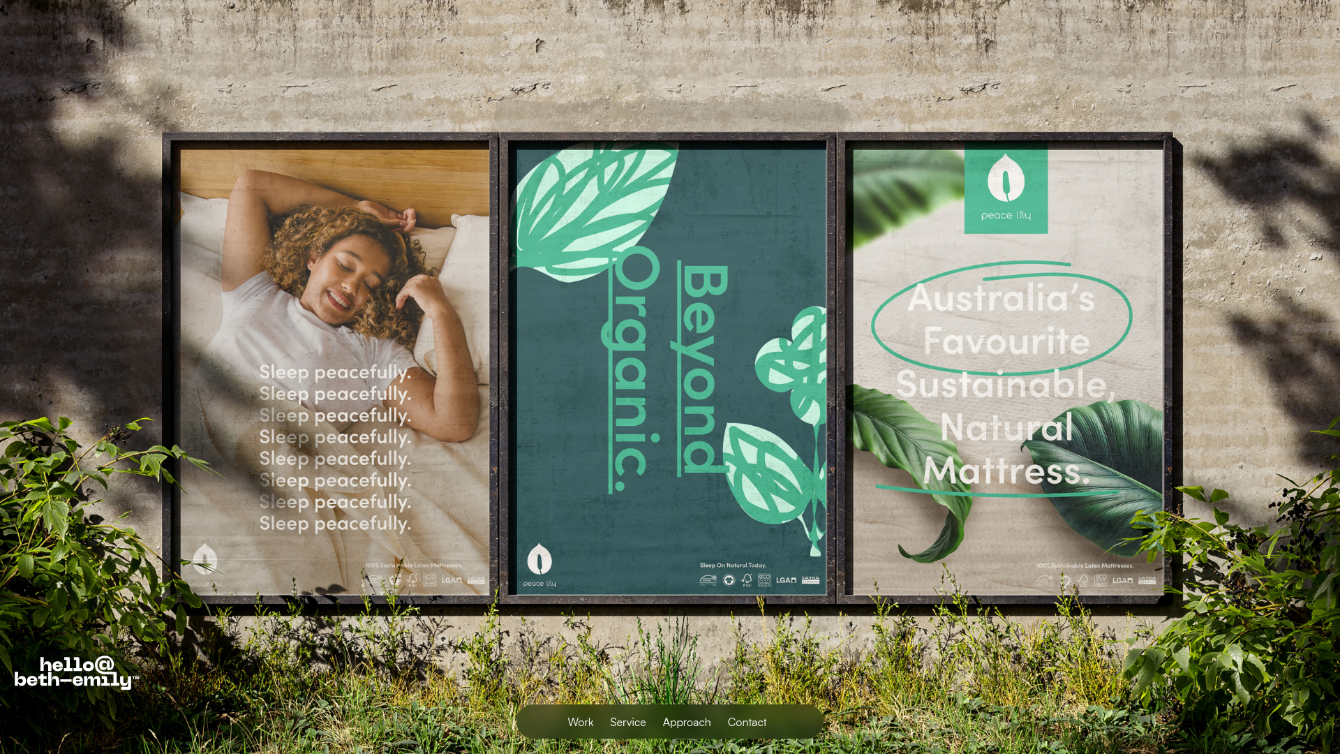
Beth-Emily Portfolio Carousel Landing Page
A minimalist portfolio layout featuring a full-width background slider, transparent navigation overlays, and an integrated bottom menu for service navigation.
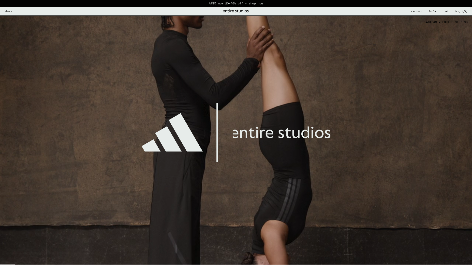
Entire Studios Minimalist Full-Screen E-commerce
A high-impact landing page featuring a full-bleed vertical Swiper scroll, sticky navigation with hidden overlays, and a bottom progress bar for video transitions.

Context Gallery High-End Furniture Landing Page
A minimal editorial layout featuring a multi-column product carousel, designer biographies with image-text pairings, and a magazine-style content grid for curated design stories.

Glein Minimalistic Bento Grid eCommerce
A clean, modular layout using a bento-style responsive grid of text teasers and large-scale product imagery for lookbooks and collection browsing.

Isla Beauty Skincare E-commerce Store
A clean Shopify-based storefront featuring a split-hero landing page, a step-by-step product system carousel, and a split-screen testimonial section with localized product image sidebars.

Stojo Collapsible E-commerce Storefront
A Shopify layout featuring a prominent discount modal, mosaic grid hero sections, and clean product cards with integrated color swatches and quick-buy functionality.
