XXXI Studio Architecture Portfolio Showcase
A minimalist design portfolio featuring high-contrast overlapping typography, sticky project captions, and a dynamic masonry-style image grid for architectural storytelling.
Overview
This portfolio for XXXI Studio is a masterclass in minimalist architectural storytelling, characterized by a bold, overlapping typographic hero and a dynamic, asymmetric image grid. It uses high-contrast visual layers and sticky elements to create a cinematic experience that prioritizes high-resolution photography over complex UI. This site is an excellent reference for builders looking to implement unique vertical scroll behaviors and sophisticated blend-mode typography.
Design System
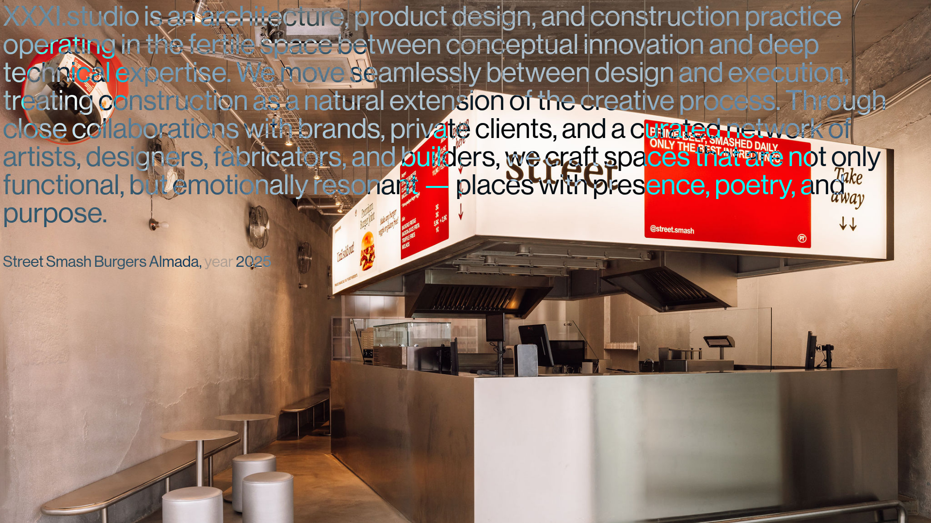
- Color Palette & Visual Hierarchy: A neutral, high-contrast palette of white and deep black dominates. The use of
mix-blend-differenceon text elements allows typography to dynamically shift color based on the underlying image, ensuring legibility while creating a "built-in" aesthetic across varying photographic backgrounds. - Typography System: The site uses a heavy sans-serif typeface with tight tracking for the hero section, creating a tactile texture. Scale is used aggressively, with the overview text occupying a large portion of the viewport. Project labels use a smaller, functional scale with lower-opacity spans (e.g.,
text-white/25) for metadata like "year." - Page Structure: The layout follows a linear vertical flow composed of
<figure>elements (classproject clone). Each project is a block of 1-2 images positioned with staggered alignment (justify-startvsjustify-end) to create a masonry-like rhythm during scroll. - Reusable Components:
- Sticky Captions: The
<figcaption>elements usefixedpositioning with a calculated top offset (top-[calc(50lvh-0.75rem)]) andmix-blend-differenceto stay centered and legible as images slide beneath them. - Asymmetric Grid: Image containers use Tailwind utilities like
md:max-w-[calc((100vw-0.5rem)/3*2+0.25rem)]to create precise, non-standard column widths.
- Sticky Captions: The
- Interactions & Motion: The primary interaction is the scroll-triggered visibility of project labels. Figures transition from
opacity-0toopacity-1(andhiddento visible) as they enter the project focus area. Images utilizeobject-coverand specific aspect ratios (aspect-3/2andaspect-4/5) for consistent framing. - Implementation Clues: Built using Tailwind CSS, evident from utility classes like
flex-col,gap-1, andinset-x-0. The use ofdata-currentattributes andeagerload/lazyloadclasses suggest a lightweight JavaScript implementation for handling scroll states and image performance.
Use Cases
- Who should clone this: Architects, interior designers, and high-end product studios who need to showcase a large volume of visual work without the UI distracting from the craft.
- Effective Remixes:
- Fashion Lookbooks: Swap architectural photos for editorial shots, using the overlapping text for seasonal branding.
- Creative Agency Portfolios: Adapt the sticky mid-screen caption for case study titles while the user scrolls through project deliverables.
- Remix Directions: Replace the black-and-white theme with bold brand colors while maintaining the
mix-blend-differenceutility to keep the typography interactive with the content. - Clone Scope: A full-page clone is recommended to preserve the specific scroll rhythm and typographic overlap, but the
project clonefigure component is a perfect candidate for a quick-section clone in existing minimalist layouts.
Related Inspirations
Artworld Agency Artist Portfolio Directory
A minimalist creative agency landing page featuring a typographic artist cloud, interactive category filtering, and image-on-hover card reveals in a clean, high-contrast layout.

Christopher Doyle Agency Portfolio Layout
A minimalist, typography-led portfolio featuring a wide-margin grid system, smooth fade-in animations, and simple image-focused project cards.

Clase Agency Branding Portfolio
A minimalist design agency portfolio featuring a typographic hero section, full-width image articles, sticky title bars, and integrated scrolling text marquees for a clean editorial layout.
Something Else Portfolio Slideshow
A minimalist design studio portfolio featuring a full-width image and video slideshow with large-scale typography, sticky navigation, and centered captions.
Caserne Design Studio Portfolio
A minimalist, high-impact portfolio featuring a dynamic masonry grid of project thumbnails with overlay text and a clean, oversized typography-driven footer.

Vita Architecture Portfolio Landing Page
A minimalist, high-end architecture portfolio featuring a custom canvas-based image gallery, split-text animations, and a project slider with dynamic image masks.
