Heavyweight Type Masonry Font Gallery
A dynamic masonry grid featuring product cards with embedded MP4/Lottie media, responsive SVG typography previews, and a unique illustrative cookie consent overlay.
Overview
This website is a sophisticated type foundry catalog that utilizes a high-performance masonry grid to showcase digital products. It is an excellent clone reference for portfolios or asset marketplaces because it seamlessly integrates diverse media formats—including MP4 video, Lottie animations, and complex responsive SVGs—into a unified, tactile browsing experience.
Design System
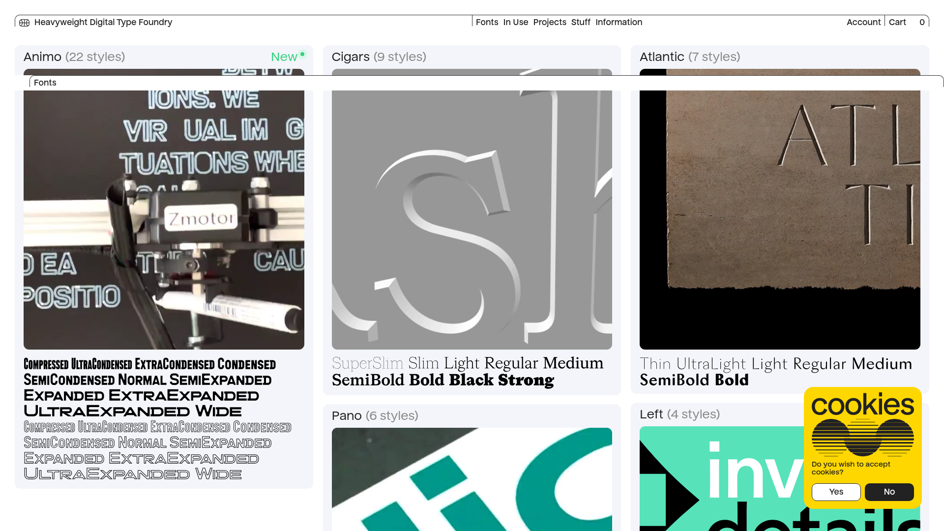
- Color Palette & Visual Hierarchy: The site uses a neutral monochromatic base (white backgrounds, black text) to allow the vibrant product media and font previews to provide the color. A single accent color (green for "New" labels) is used sparingly for status indicators.
- Typography System: The interface typography is utilitarian and small-scale, creating a deliberate contrast with the large, expressive font previews in the cards. Headings use a clean sans-serif while technical data (font weights) is presented as crisp, scalable SVG artwork ensuring pixel-perfection across resolutions.
- Page Structure: The layout follows a top-down information hierarchy: a thin global utility header, a modular utility bar, and a dense masonry gallery (
masonry-grid) utilizing absolute positioning for a staggered visual effect. - Reusable Components:
- Catalog Cards: High-value components that wrap media, headers, and weight previews in a clean container with subtle hover-state potential.
- Creative Cookie Consent: A stylized, illustrative yellow overlay containing an SVG graphic and secondary call-to-action buttons.
- Responsive Picture Sets: Complex
<picture>implementations that swap SVG assets based on five specific screen width breakpoints (mobile to Ultra HD).
- Interaction and Motion: The site leans heavily on auto-playing, muted, looped video and Lottie players (
lottie-player) to create a "living" gallery without requiring manual user interaction. - Responsive Behavior: The masonry width shifts from three columns on desktop (approx. 33% width per card) to fewer columns on smaller viewports, supported by the SVG-heavy preview system which ensures text-as-image assets remain sharp.
Use Cases
- Who should clone this: Designers and developers building creative portfolios, stock asset libraries, or agency project galleries where visual impact and media variety are prioritized.
- Effective Remixes: This pattern is perfect for physical product catalogs (e.g., sneaker drops or furniture) where seeing the product in motion (MP4) is more engaging than static photography.
- Remix Directions: Replace the typewriter-style font previews with high-fidelity product renders; swap the yellow cookie consent box for a brand-consistent modal; or adapt the masonry grid to a standard CSS Grid for simpler maintenance if dynamic height isn't required.
- Suggested Scope: A full-page clone is ideal for those needing a complete, high-end gallery experience. For a quicker win, clone the
catalog-cardstructure to use as a modular unit within an existing portfolio.
Related Inspirations

Context Gallery High-End Furniture Landing Page
A minimal editorial layout featuring a multi-column product carousel, designer biographies with image-text pairings, and a magazine-style content grid for curated design stories.

Glein Minimalistic Bento Grid eCommerce
A clean, modular layout using a bento-style responsive grid of text teasers and large-scale product imagery for lookbooks and collection browsing.

Isla Beauty Skincare E-commerce Store
A clean Shopify-based storefront featuring a split-hero landing page, a step-by-step product system carousel, and a split-screen testimonial section with localized product image sidebars.

Stojo Collapsible E-commerce Storefront
A Shopify layout featuring a prominent discount modal, mosaic grid hero sections, and clean product cards with integrated color swatches and quick-buy functionality.

Basic.Space E-commerce Gallery Clone
A minimalist product marketplace featuring a clean sticky navigation bar, nested flyout menus, and a horizontally scrollable product carousel with hover-state image switching.

Ashley & Co Lifestyle E-commerce
An elegant Shopify-based storefront featuring a split-screen animated hero, horizontal ticker-tape collection carousel, and dynamic mega-menus with scent-specific color switching and image previews.
