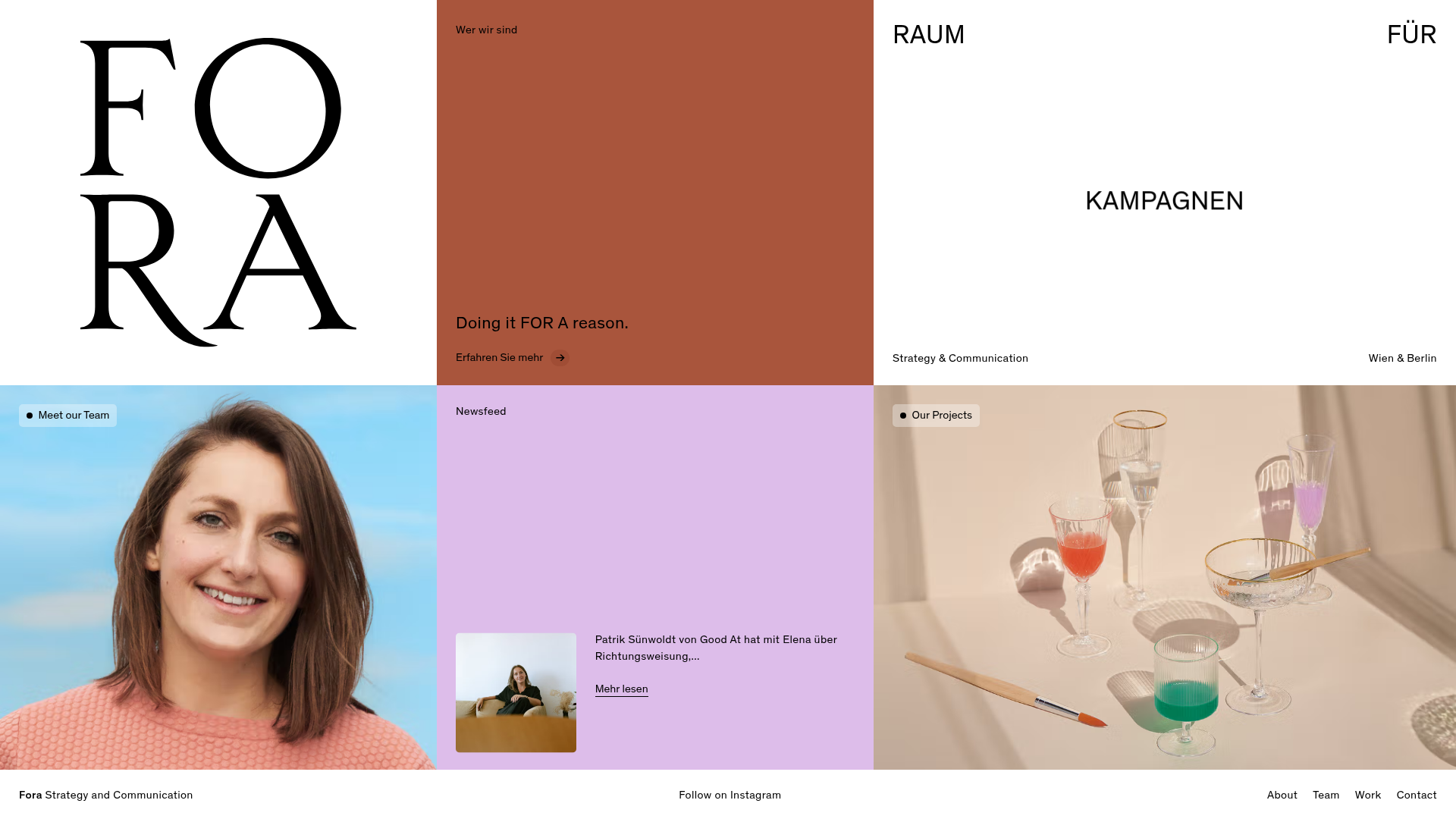
Fora Concept Bento Grid Website
A minimalist colorful bento grid layout featuring hover-responsive media blocks, animated text carousels, and content-rich slide-over overlays.
Overview
This website for Fora Concept is a masterclass in the bento grid architectural style, utilizing a high-contrast, multi-colored layout to categorize brand information into distinct, interactive blocks. It serves as an excellent clone reference for its seamless blending of raw typography, vibrant solid colors, and high-quality photography within a rigid yet fluid container system.
Design System
- Color Palette & Visual Hierarchy: The site uses a bold, primary-driven palette including deep terracotta (#A65335), soft lavender-pink, and stark white. Visual hierarchy is established through alternating block sizes and background colors rather than traditional top-down scrolling, making every tile a focal point.
- Typography: A dual-system approach featuring a large, elegant high-contrast Serif for the logo (FORA) and large headings, paired with a clean, functional Sans-Serif for body text and micro-copy. Text is often used as a graphic element, such as the vertical and architectural alignment of "RAUM FÜR KAMPAGNEN."
- Page Structure: The layout is a non-linear grid. Key sections include a branding block, an about intro, a dynamic text-switching service block, team previews with high-fidelity portraits, and a newsfeed toggle.
- Reusable Components:
- Interactive Bento Tiles: Anchor tags (
<a>) used as grid items with data-attributes for transitions. - Status Badges: Small rounded buttons with a live-status dot indicator (e.g., "● Our Projects").
- Slider Overlays: Hidden
divcurtains withdata-news-overlaythat slide into view for content deep-dives. - Marquee Text: A
data-marqueecomponent used on mobile for horizontal scrolling news.
- Interactive Bento Tiles: Anchor tags (
- Interaction & Motion: The UI features sophisticated hover states (
hover-img) where images replace solid backgrounds, and a unique text carousel that cycles through "Kampagnen, Erlebnisse, Gedanken" within the service block. - Mobile Behavior: The design transitions from a multi-column grid to a single-column stack. The newsfeed converts into a horizontal
keen-slidercarousel on smaller screens, and the marquee becomes active for the newsletter CTA. - Implementation Clues: The HTML reveals a Tailwind CSS framework (utility classes like
flex,inset-0,z-40,order-none) and a data-driven router wrapper (data-router-wrapper) likely used for smooth SPA-like transitions.
Use Cases
- Who should clone: Creative agencies, design studios, and freelance portfolios looking for a non-traditional way to showcase strategy and visual work simultaneously.
- Effective Remixes: This pattern is ideal for luxury hospitality or editorial sites where imagery and text-based storytelling need equal weight.
- Remix Directions: Swap the vibrant terracotta and pink for a monochrome or brutalist grayscale palette to shift from "approachable" to "premium minimalist." The info architecture can be adapted by keeping the grid but replacing the "Newsfeed" with a "Services" pricing list.
- Clone Scope: A full-page clone is recommended to capture the sophisticated interplay of grid transitions, but the individual bento tiles with image-hover effects are highly reusable for landing page sections.
Related Inspirations
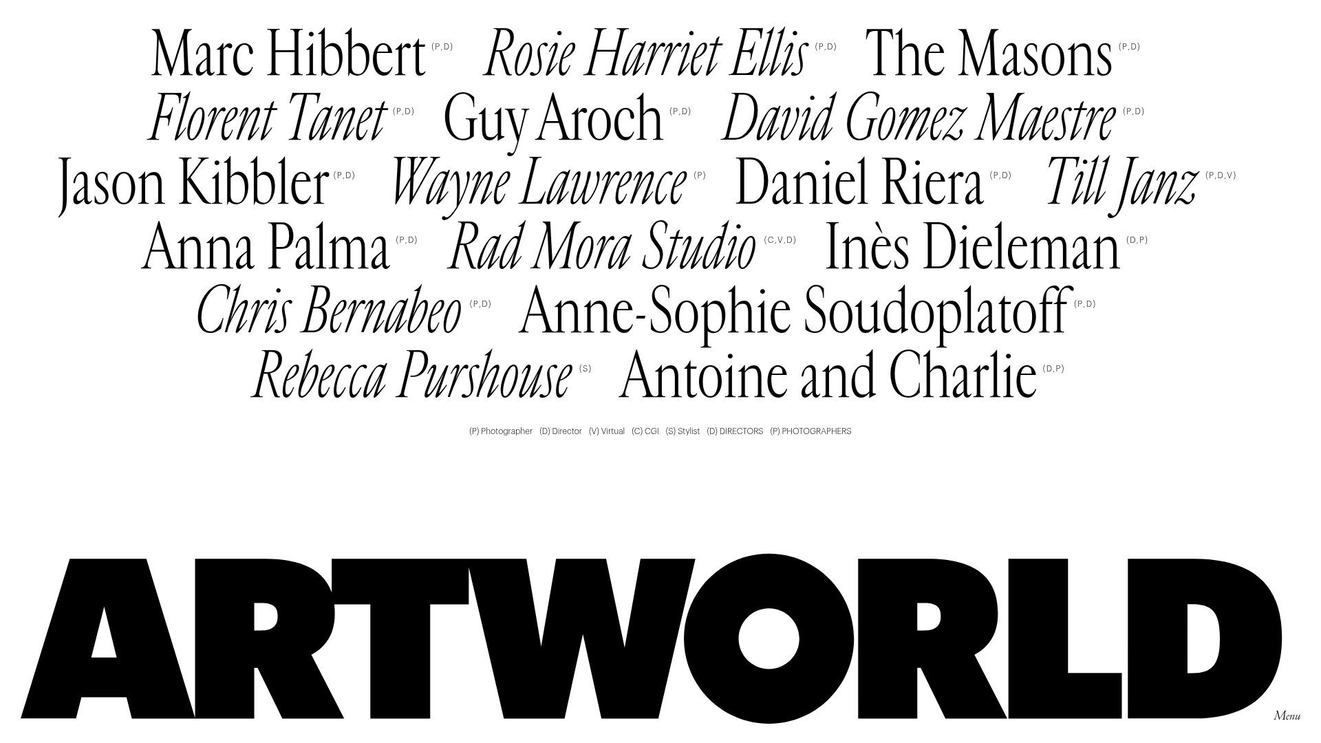
Artworld Agency Artist Portfolio Directory
A minimalist creative agency landing page featuring a typographic artist cloud, interactive category filtering, and image-on-hover card reveals in a clean, high-contrast layout.
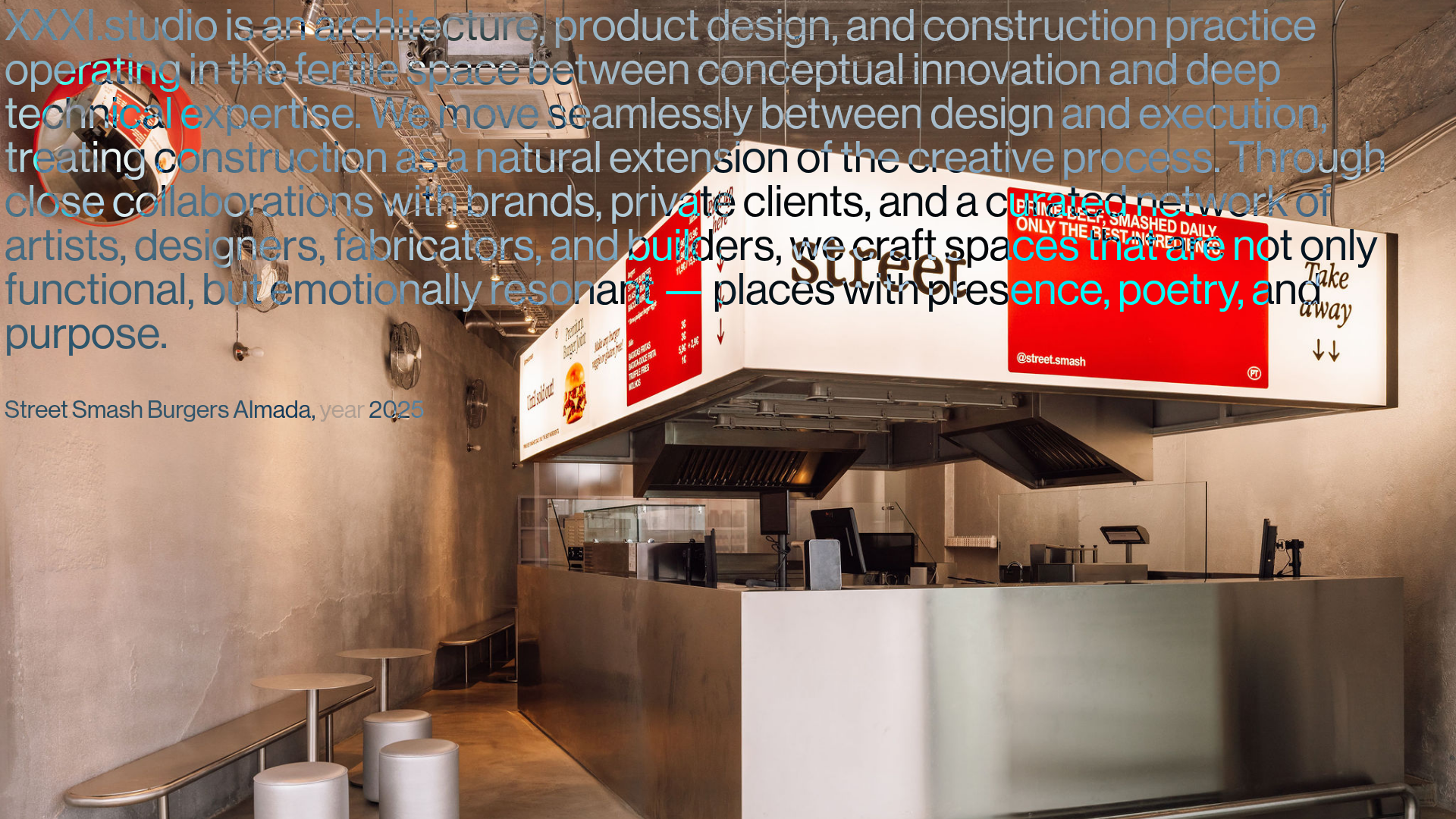
XXXI Studio Architecture Portfolio Showcase
A minimalist design portfolio featuring high-contrast overlapping typography, sticky project captions, and a dynamic masonry-style image grid for architectural storytelling.

Christopher Doyle Agency Portfolio Layout
A minimalist, typography-led portfolio featuring a wide-margin grid system, smooth fade-in animations, and simple image-focused project cards.
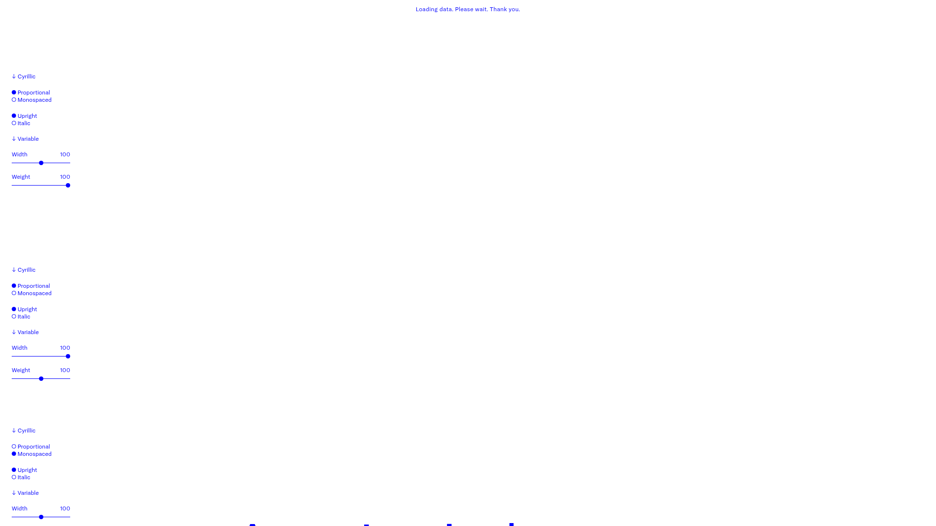
GT America Typography Tester
A layout-heavy landing page featuring interactive font testing toolkits with multi-language support, font-weight sliders, and content-editable text areas.

Clase Agency Branding Portfolio
A minimalist design agency portfolio featuring a typographic hero section, full-width image articles, sticky title bars, and integrated scrolling text marquees for a clean editorial layout.
Something Else Portfolio Slideshow
A minimalist design studio portfolio featuring a full-width image and video slideshow with large-scale typography, sticky navigation, and centered captions.
